

To begin the project I needed to get my mind in the right place in order to create initial sketches and drawings that will enable me to follow on through the process to a digital platform.
Through drawing and sketching and exploring my chosen locations i was hoping to:
- Get a sense of the colour and tones that are found helping to create the ambience of the location
- explore different ways that i could recreate the location on a digital platform
- look at the shapes and patterns that are found in the location and begin to think about how i could use illustrator with my (at the moment very limited knowledge) and translate them into shapes and forms.
- also just drawing the locations seems like a logical place to start and will help enhance and develop my knowledge and understandings of the locations.


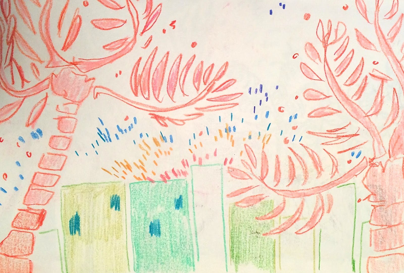
I have started my sketches by looking at images of miami and seeing how i can simply translate them without adding too much detail and line work.
Adding a lot of detail is an issue that i often have with my work, i think that for this project i really need to focus on coming away from that idea and seeing how i can work and use my skill to try and focus on the shapes and patterns instead.
This will be a big challenge for me but i am very willing to try!


The more and more i have been practicing in my sketchbook using block shapes and colours, the easier is becoming to visualise my working method in a different way.
I think that the module of visual language has really helped my in this way, as the year and project and sketchbook work has gone on and developed, my understanding of using shape and block colour has also drastically improved. This is proving to be very helpful for this brief in particular.
 |
| (very bad photo I KNOW!) |
I instantly began to think about the colours that are associated with locations, especially miami, i began to think about:
- 80's miami
- funky shapes and groovy patterns
- pastel gradients
This was a really exciting turning point!
I wanted to experiment more before i became settled on the idea of focusing on the representational colours.


Following my discovery, i began to think in more depth about how i could use bright and bold colours in a way that is representational yet effective and very telling of the way i can form and create my own images.

This early phase in this brief has been SO helpful for me, I've started to see the possibilities of working with shape and block colour and can definitely see the value and contributions that it can have to illustration.
I've struggled to see how blocks of colours can form an image alone but through experimenting and research i'm really starting to understand that. VERY EXCITING.
I'm really pleased with the way that my final initial skecthes were starting to take shape, i think even with my limited knowledge i will be able to form something out of my initial research.
I'm still not completely sold on the idea of working in this way and it will definitely take more experimenting and roughing to help me see what other images i can create.
No comments:
Post a Comment