

- value draws your eye towards different elements within the image.
- colour and tone acts as a guide towards the focal point of an image.
How can we use value to attract attention?
- the contrast between the foreground and the background can attract attention to certain elements within the frame.
What are the most commonly used value palettes?
- light against dark
- dark against light
- dark and halftone against light
- light and dark against halftone
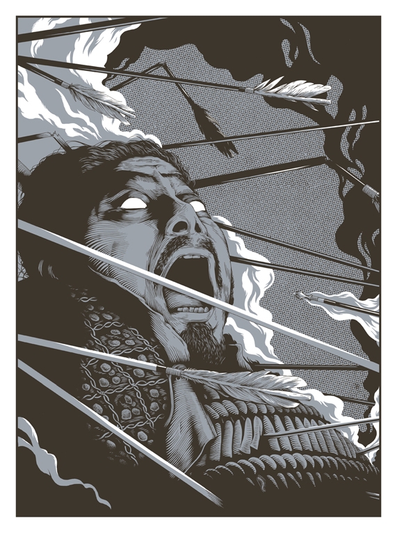
I am really drawn to this piece by Joe Wilson, I'm not often a fan of monochrome images but through learning about the mixing of halftones with light and dark tones, I'm finding it really interesting, particularly in the way that colour can manipulate an image and change the way that we see it. In this particular image, the white shows through and creates a balance between the light and the dark colours.
IMPORTANT THINGS TO KNOW ABOUT COLOUR PALETTE
-Limiting your colour palette will add an element of control and will allow the viewer to read the piece more easily.
- the colours need to work together in order to create a harmony.
- colour a large image with a similar family of colours and then...if necessary...add a single accent of colour to make it POP!
COLOUR PALETTES SHOULD...
- Contrast
- Accent
- Compliment
- Harmonise
- Vary
Tin Tin explores this exactly by using a family of colours and then using certain accent colours to make tin tin POP out of the frame. I love this and I have really gained SO much from this session. I feel like colour has just clicked in my head, I feel like this is probably the most important thing that I have discovered, not overall, but just for myself during visual language!

No comments:
Post a Comment