Showing posts with label OUIL404 VISUAL LANGUAGE. Show all posts
Monday, 14 March 2016
Sunday, 13 March 2016
Colour Investigation
Following on from the value task, i wanted to explore colour in more depth as its something that i have almost taken for granted in the past. When learning about it, i realised that i haven't properly considered my use of it before, and this in some ways, was quite shocking to me. I created a random design involving shapes and used mono printing to explore the way that i used colour.
Monoprinting as a technique relies on the mixing and blending on tones and values and in this aspect i find it really helpful to help me to learn about the way that colour works together to create
I explored the way that i can mix the blues and pinks to create different tones and values. I found this mini task that i set myself really helpful and useful to help get my head around colour.
Also, based on this task and visual language as a whole, i have definitely improved with my use of shape. At the start i really struggled with the concept of shape as was unable to make pieces without using details or lines, however i have come out the other side of visual language creating purely shape based works.
Saturday, 12 March 2016
Value Task
Following the presentation on value and colour, i have felt really inspired and intrigued by working with colour. I completed the outfit task by choosing one with similar tones and values. I think this works well in terms of looking at the way that colour can create different moods and narratives.
Despite my red hair, i think the lilac tones and peach and pink values are complimented by the clashing red. the red works almost as an accent agains the pastel tones.
Thursday, 10 March 2016
ADOBE COLOUR CC
I've been looking at the webitse Adobe Colour CC in order to assist me in looking at colours and how they can work together and contrast each other. I think this is such an effective tool to have as I have learnt that colour can literally make or break an image. It effects the composition, the depth, the narrative and the whole illustration in general if not done effectively.
"Analogous"
"Monochromatic"
"Triad"
"Complimentary"
"Compound"
"Shades"
I will definitely be using the website again as it has really opened my eyes to the colour possibilities that I want to explore even further within my own work.
Tuesday, 8 March 2016
Colour and Value Presentation
What role does value have in composition?

Tin Tin explores this exactly by using a family of colours and then using certain accent colours to make tin tin POP out of the frame. I love this and I have really gained SO much from this session. I feel like colour has just clicked in my head, I feel like this is probably the most important thing that I have discovered, not overall, but just for myself during visual language!

- value draws your eye towards different elements within the image.
- colour and tone acts as a guide towards the focal point of an image.
How can we use value to attract attention?
- the contrast between the foreground and the background can attract attention to certain elements within the frame.
What are the most commonly used value palettes?
- light against dark
- dark against light
- dark and halftone against light
- light and dark against halftone
I am really drawn to this piece by Joe Wilson, I'm not often a fan of monochrome images but through learning about the mixing of halftones with light and dark tones, I'm finding it really interesting, particularly in the way that colour can manipulate an image and change the way that we see it. In this particular image, the white shows through and creates a balance between the light and the dark colours.
IMPORTANT THINGS TO KNOW ABOUT COLOUR PALETTE
-Limiting your colour palette will add an element of control and will allow the viewer to read the piece more easily.
- the colours need to work together in order to create a harmony.
- colour a large image with a similar family of colours and then...if necessary...add a single accent of colour to make it POP!
COLOUR PALETTES SHOULD...
- Contrast
- Accent
- Compliment
- Harmonise
- Vary
Tin Tin explores this exactly by using a family of colours and then using certain accent colours to make tin tin POP out of the frame. I love this and I have really gained SO much from this session. I feel like colour has just clicked in my head, I feel like this is probably the most important thing that I have discovered, not overall, but just for myself during visual language!
Saturday, 5 March 2016
Final Screenprint
Overall i was really happy with the outcome of my screen print, i feel that i have successfully considered the colour and textures within the print. I also think that i have thought about the way that i have portrayed phil mitchell as a character, thinking about transforming his look into a comical, illustrative style with mark marking and bold lines.
However, the task was meant to focused on depth and line of sight and i definitely don't think that this has been considered very well in this screen print. I should have done more roughs and planning and then maybe this would have been a possibility to consider. I tried to add a small sense of depth by adding in the river thames but i don't think that this has pulled off and doesn't really have any depth. despite this, i really like the image as a piece of fan art and i have learnt a lot about the meaning of depth and line of sight despite not applying it to this particular piece.
Friday, 4 March 2016
Screenprinting for Viewpoint Task
I decided to go for a selection of a bright red and navy blue as not only do these colours symbolise england, and london, where eastenders is set but I felt that they would contrast well and work well as a screen print with the darker navy sitting well as the outlines on the top. I also considered that the red wasnt too light to not show up and would possibly add a sense of depth to the screen print.
I was really happy with the red colour that i used in the screen print but If i were to choose the colours again then i would probably use a lighter blue as the value was too dark and ended up looking a bit blackish which defeated the colours symbolising london.
Thursday, 3 March 2016
Fan Art Sketchbook Work
I started the fan art task by deciding on phil mitchell as I'm a fan of the soap eastenders. i felt like i didn't want to be too serious with the task and i thought that the character of phil had potential to be humorous with charm aswell. i began by creating rough sketches and more realistic images of phil mitchell to get an idea of the general face shape and features on his face, this really helped with creating more illustrative cartoon style versions of the character.
my next step was to simplify the portrait down into a more cartoony style, i didn't want to overcomplicate the image if i was going to be screen printing it and using depth and line of sight within the image.
i particularily liked the experiments where i had made phil's head more round, i found these quite funny and wanted to see how they would work as a more detailed piece exploring colour and other marks within the face to create the features.
Once i had chosen the way that i was going to create the image, i began to consider colours that i could potentially use in the screen print. as its a screen print the limit for the task was 2 colours. coloration in screen printing is definitely something that i have struggled with in the past, particularly with the past book project. i want to improve therefore ill keep the image simple to begin with in order to add colour and adjust the way i can use it.
after this i began to have doubt about the way i have been creating the image, i changed my design to a more realistic piece as i felt a bit lost in terms of the fact that i was supposed to be considering the depth. this really hasn't gone anywhere in this task, I'm finding it really difficult to consider the concept of layering in screen printing colours whilst still looking at the line of sight and how this effects the frame.
I drew out the design that i had previously been working with as I feel that it was more effectively portrays the essence of phil mitchell and in a comical way aswell. I drew the design out on tracing paper and began to play around with the iconic image of the river thames used in the eastenders theme tune. Although not much, this river will add a sense of depth to the image.
Following the experimentation, i have decided on the final image that i will be using for my screen print. The river will run below the portrait of phil in order to frame him and create the sense of depth but still keeps the simplicity behind the image.
Wednesday, 24 February 2016
Viewpoint Presentation
What do we mean by depth of image?
- The creation of the illusion of distance or a third dimension.
- Overlapping and using different sizing and scale.
Is depth only relevant to people who want to make realistic images?
- depth is relevant if it works with the narrative and composition of the piece.
What is line of sight?
- the direction in which our eye moves when looking at the image.
What does line of sight do for the composition?
- draws your eye around
- gives the image movement
This image by Mobius, for me, completely defines the idea of viewpoint and depth of field. The way that the image and line of sight follow through creating a pathway that guides the viewer through the image is so effective and really inspires me to focus more on viewpoints within not just visual language, but other briefs aswell. The way that the contrast between the bird and the edge of the cliff create an X shape also is such an effective aspect for me. Everything about this image just draws me in and inspired me within my own practice!
Friday, 12 February 2016
Frame Task
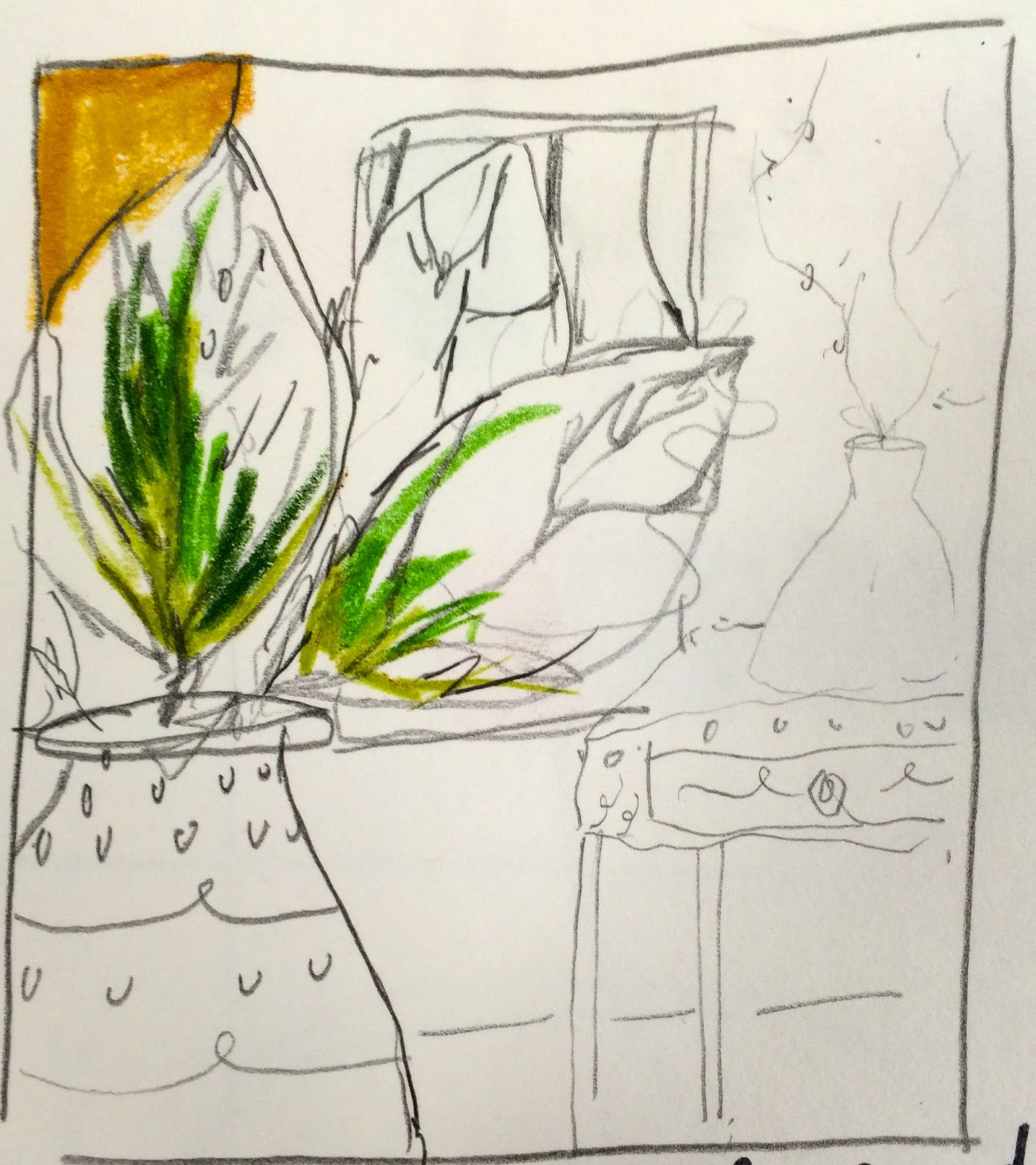
Before starting the frame task, i began by creating a series of roughs that would explore the way that i can use frame effectively using the whole frame to its full potential. Roughs are definitely very important when it comes to creating something such as frame as its important to consider a variety of ways that frame and composition can be used to create the most effective image.
i think that this frame works well as a whole, I'm looking at symmetry and the sizing and form of the objects.
im not sure about this frame, i feel like the composition doesn't use the frame to its full potential. the butterfly seems out of place and almost an after thought, however, I'm happy with the line of sight from the trunk to the person in the air.
i don't think that this composition uses the frame very well. i can work harder to create a better composition that uses the whole frame effectively, again the butterflies seem like an afterthought, i think because they're small i haven't really considered their placement on the page.
in this rough, i have combined the line of sight and the direction that the image travels in order to make an effective frame.
this is thinking about the layout in a completely different way with the human being the largest and the elephant the smallest, a complete swap of roles.
i really like the idea of thinking about the composition in a way that isn't obvious. the task to draw an elephant, human and butterfly seems clear to do but i really like the idea of going about it in a completely different way. i want to develop this idea further, however, as a frame i don't this it is as effective as it could be.
i tried to develop this idea into something more refined, however, I'm not convinced that it is the best demonstration of frame and composition, i can definitely do better than this.
i took one of my previous rough ideas that i felt had the best potential, i have tried to refine it and make it have the best frame that it possibly can. i think the arch of butterflies definitely work and in this sense don't seem like an after thought compared to some of my other roughs. the symmetry between the elephant and the human really pull the image together.
in the final piece, i really struggled with the use of ink in which we were required to make the piece in. i don't like the texture of it and I'm some ways takes away from the frame due to the watery nature and uncertain lines. however, i feel that through the exploration in my roughs i have been very successful with the way that i have used the full potential of the frame. in terms of sizing, and symmetry i have successfully creating the image. the butterflies almost create a frame around thee work making it work together and coherently.
Thursday, 11 February 2016
Frame Presentation
Notes from Presentation
How can we place importance on certain information in a frame?
This can be done by changing the size of the object, larger often means more important and smaller is less.
When an object is centred in the frame is often indicates importance and dominance.
What are the benefits of overlapping and how can this be achieved?
Overlapping is a good way to organise varied objects in interesting arrangements.
Not everything has to overlap.
Overlapping creates depth.
What role does frame play in composing visual information in your image?
Frame creates atmosphere.
Cropping and cutting the image down can change the way frame is used.
Laura Callaghan
|
Tomer Hanuka
- Line of sight draws the viewer to the womans gaze looking up to the window.
- The line of sight also follows the raindrops as the fall past the window.
- The colour schemeis basic and simple allowing the narrative to be easy to read.
Brian Saunders
- the negative space of the piano creates a frame around the top of the image.
- the size of the piano in the foreground also contributes towards this framing
- the line of sight between the window panes and the arches of the piano draw you into the centre of the image.
Sunday, 7 February 2016
Composition Task
In the composition task I really tried to focus on the way that I used shape and sizing of the objects in order for them to work as a coherent piece that has harmony and uses the guidance of a line of sight , this is a very important aspect when considering composition. In my roughs I was able to consider the way the room could work in different styles and ways whilst still having each component in the frame.
I feel that I could have worked harder on the way the frame physically works together as I feel that I rushed into choosing an idea without much consideration into how I could push myself ever further! I also don't like the way that I've used colour in the piece, in terms of colour and the composition I don't think that it considers itself well thinking about the depth of field and the other possibilities that colour can create.
Despite my feelings of dislike towards this image I feel that I have really expanded my work in terms of being able to consider the way composition can completely change the narrative of a frame. This is such an important thing to learn and try to expand on within illustration.
Large plant in left foreground.
Small vase and table with twigs and flowers in mid ground.
Window in background.
Vase, table and twigs in foreground.
Large plant in mid ground.
Window in background.
Window in foreground.
Large plant in mid ground.
table and vase and twigs in background.
table and vase and twigs in foreground.
window in mid ground.
large plant in background.
large plant in foreground.
window in mid ground.
vase and twigs in background.
large plant and table with vase and twigs in foreground.
window in background.
I changed my design to a circular window as I felt that it would make for a better composition making the image more symmetrical and work as a whole.
I also experimented with the colour palette, looking at how I could use the different colours to create a depth of field within the image.
My final rough took elements from each that I liked and i thought made for a good composition, taking into account the line of sight, depth of field and elements such as overlapping of objects which is something to consider when creating a good composition.
I think that the final composition considers itself well in terms of the way the image flows through, thinking of the line of sight from the way the window is the central point of the image, flowing through to the twigs on the plant and the leaves on the potted plant. I think my roughing really helped with this aspect.
I feel that I could have worked harder on the way the frame physically works together as I feel that I rushed into choosing an idea without much consideration into how I could push myself ever further! I also don't like the way that I've used colour in the piece, in terms of colour and the composition I don't think that it considers itself well thinking about the depth of field and the other possibilities that colour can create.
Despite my feelings of dislike towards this image I feel that I have really expanded my work in terms of being able to consider the way composition can completely change the narrative of a frame. This is such an important thing to learn and try to expand on within illustration.
Subscribe to:
Posts (Atom)