Rainbow
Showing posts with label OUIL403 VISUAL SKILLS. Show all posts

Sunday, 15 November 2015

OUIL403 VISUAL SKILLS - End of Module Self Evaluation - BA (Hons) ILLUSTRATION

1.  Which practical skills and methodologies have you developed within this module and how effectively do you think you are employing them within your own practice?

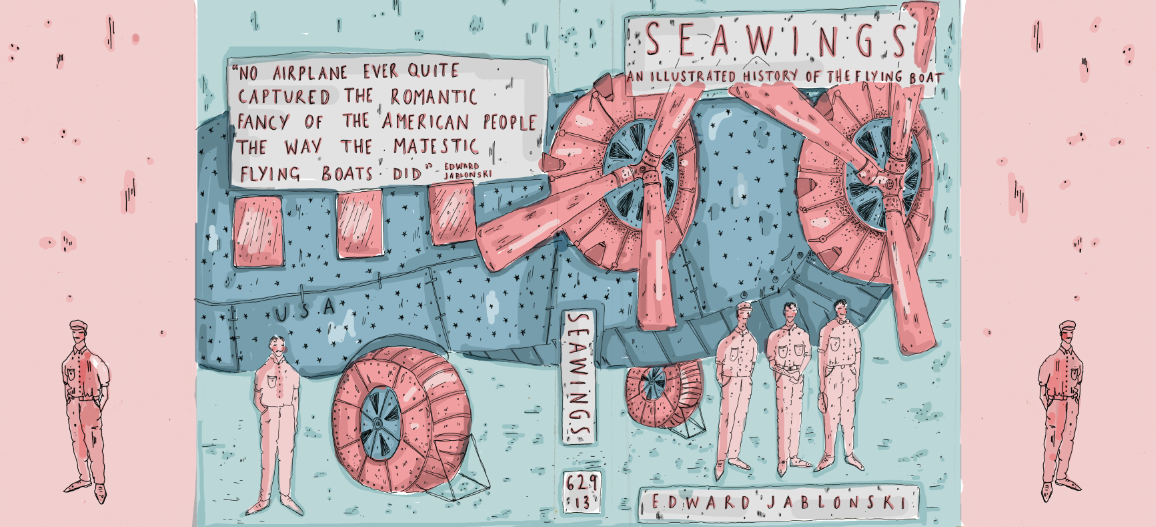
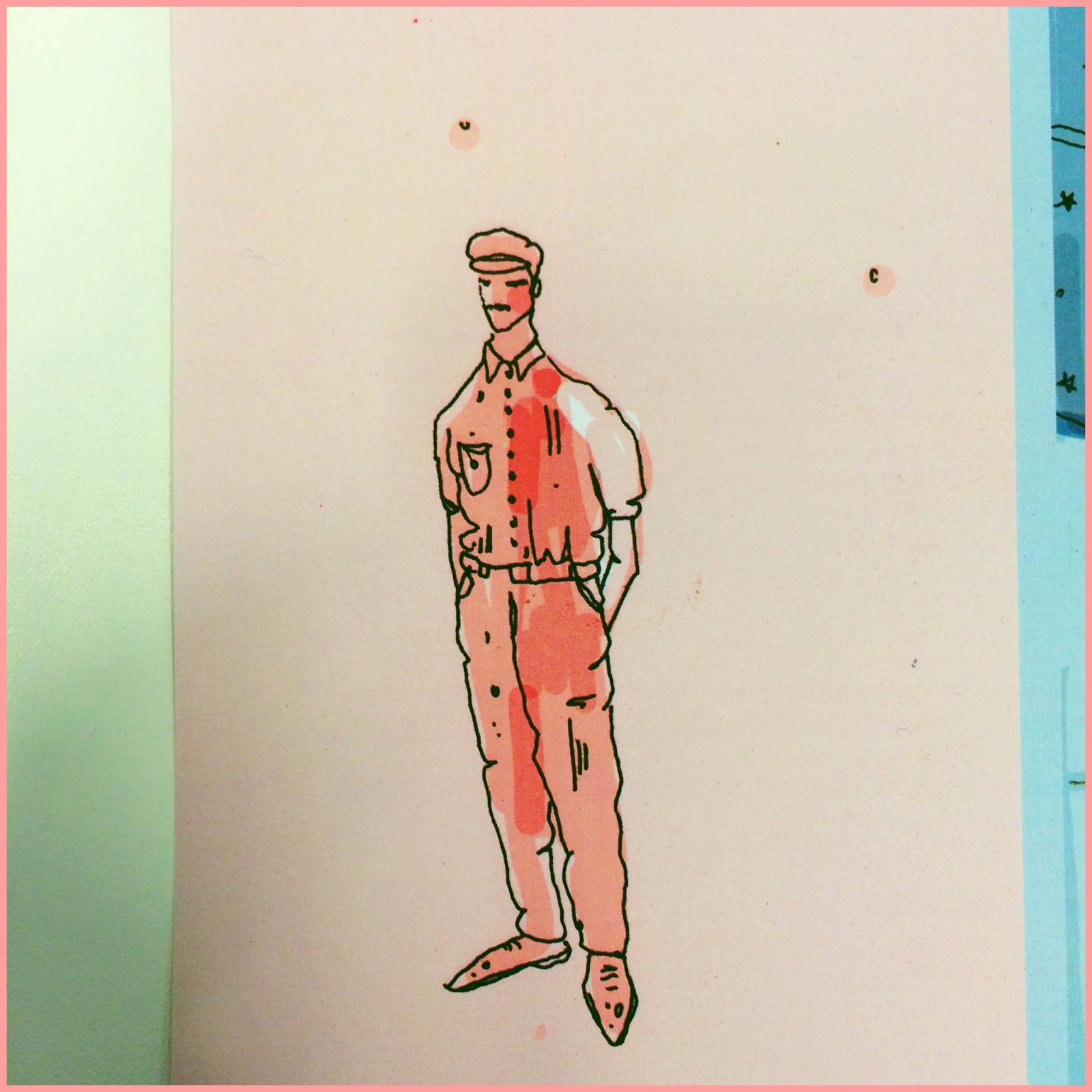
In the visual skills module I have learnt a variety of skills and illustrative techniques that have enhanced my image making skills. I definitely feel that my use of colours and colour palettes has improved since doing the visual skills module. I found that when the brief specifically said to only use 2-3 colours it really challenged me to be selective as this is something that I have struggled with in the past. In the final book cover brief in the module I feel that I effectively employed the selective use of colour technique.
I also found that the idea of working to a specific size restraint to be very helpful in order to aid my practice and since the briefs I have found myself trying to work to specific scales and shapes. 

2. Which principles/ theories of image making have you found most valuable during this module and how effectively do you think you are employing these within your own practice?

In the module I have found the idea of repetition and roughing very helpful in the process of image making. When initially getting a brief, I now draw everything that comes to mind based on words and ideas in the given task. I find that when repeating the same drawings multiple times I begin to generate new ideas, this is definitely something that I have taken away from the module. Also, the method of rough is very valuable when it comes to idea generation and creating more effective outcomes.

3. What strengths can you identify within your submission and how have you capitalised on these?

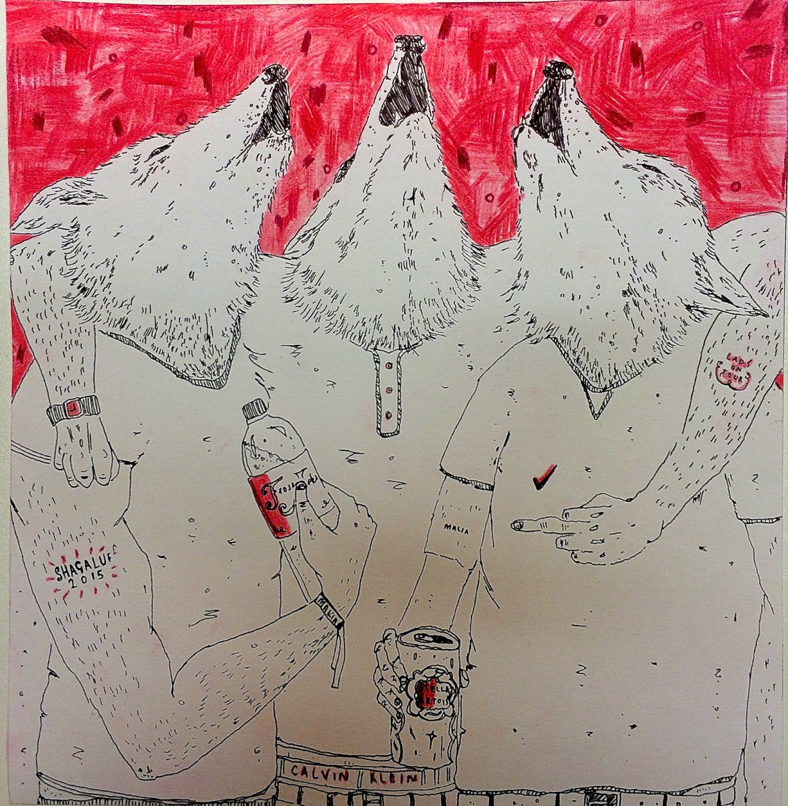
In my submission of Visual Skills I feel that my strengths lay within the character and in some cases, the narrative in my work. I definitely feel that through the planning and image making process, I was able to create a variety of different characters that tie my work together and in some cases add a humorous element to the pieces. Particularly in the 'Day in the Life' brief where I explored the idea of visual metaphors and using wolves as opposed to human characters to represent 'LAD culture'  

4. What areas for further development can you identify within your submission and how will you address these in the future?

I feel that within my work I need to focus on the idea of narrative in order to allow the viewer to me more engaged and emotionally attached to my work. To do this I could look further into the topic I am exploring in order to get a better understanding of the physical story behind it. I also feel that I need to explore media in more depth, focusing on how I can use digital aspects to enhance my hand drawn work and vise versa. 

5. In what way has this module introduced you to the Ba (Hons) Illustration programme?

The module has definitely taught me that illustration does not necessarily have to be about the drawing or the 'likeness' to the subject, but should focus on how to convey a certain message or idea to the subject that you are illustrating. I have been introduced to the idea that illustration and image making are different but at the same time both need to work together in order to be the most effective it can be. I have also been introduced to the idea that the creation of an 'illustration' itself needs multiple experiments and roughs, with a lot of idea generation in order to be identifiable to the topic. 

6.How would you grade yourself on the following areas:

Attendance - 4

Punctuality - 5

Commitment - 4

Quantity of Work Produced - 3

Quality of Work Produced - 4

Contribution to the Group - 4


Saturday, 14 November 2015

Do Judge A Book By It's Cover - Final Bookcover

For my final book cover design I decided to use a digital media as this is something which I definitely would like to improve with. I am really pleased with how it has turned out and I definitely feel that my Waterstones research an many experiments have played a very large part in making the book cover, in my opinion, a successful one.

What do I like?

 I am particularly pleased with how I have approached the colour scheme of the book cover. Before starting on the course I would have approached this with a very large colour palette but the idea of being selective with colour is definitely something that I have learnt and have found that it's a very useful tool in order to make the cover more readable.
I'm also pleased with how I have done a large scale illustration and used the whole book cover to display this, I am really pleased with how I have made the design flow through.

 What DON'T I like?

I feel that I could have worked more on the illustration of the plane as this is a subject that I haven't approached before and I could have definitely worked more on the proportions, sizing and angels of the structure.
I am really happy with the colour scheme but I'm unsure as to whether the palette suits the tone of the book, I tried to get across the idea of a nautical theme but I don't think this comes across very well at all and instead looks almost too 'cutesy' and shiny which I am not a great fan of.


What would I of done DIFFERENTLY?!


If I were to do the cover again I would have definitely looked into different ways that I could print as I found that the colours changed quite a lot when I printed with the printer. Due to time and printing restrictions I wasn't able to do this but for my next digital based project I will definitely look further into this.
I would have also experimented even more with different colour schemes and potential layouts that would possibly be more effective?
I would have probably made the title more central and made a bigger deal out of it as I feel that at the top it is slightly out of the way and through my research I found that it should be central and I ignored this aspect which I definitely shouldn't have.
I also liked this more simple colour scheme, however I felt that I couldnt just leave it so simple, maybe this is something I need to work on and get over the idea of the need inside of me to over complicate and over decorate.

Overall I am fairly pleased with the cover but I definitely think I need to improve on my photoshop skills.

Thursday, 12 November 2015

Do Judge A Book By It's Cover - Colour Experiments


I have been looking at the different ways that I could use colour in the final book cover. I definitely think that based on the other projects, I am going to keep the colours very simple as I found this really helped and looked very effective in the other two briefs.
I particually liked the blue and red experiments as I linked the idea of 'sea wings' with nautical themes, which is often associated with blue red and white.
After these experiments, I definitely don't think that I need to over complicate the colours and patterns.

My next step will be to add in more tone and detail into the base drawing before creating the final design.

Do Judge a Book By It's Cover - Experiments

 Following my group tutorial and feedback on my roughs, I have selected the chosen design. I am now looking at how I can physically create it. I really wanted to use elements of digital media in this project, however, I feel that although it can assist me in creating the final piece, I realise that there will be issues with printing due to the scale and dimensions. 

I have started to explore colours and potential palettes that I could use. I have started to do this on photoshop because it will defiantly be easier rather than the repetition of photocopying and painting. I need to experiment more before coming to a final conclusion. Next I am going to experiment with media such as gouache and pro markers. I'm finding it difficult to make the piece look 'professional' and finished but still creative as this is something which I haven't had to consider in the past.

Monday, 9 November 2015

Do Judge A Book By It's Cover - Roughs


I completed a series of 5 roughs in order to get a better understanding of how I could approach the topic of 'SEAWINGS' and flying boats. I found it hard to initially come up with 5 different concepts but through research and sketching of different themes surrounding the topics I was able to come up with a selection of ideas.


I definitely liked some of my roughs more than others. I particularly liked the designs with the people in as I found that this gave the covers character and this is something I wanted to display. I found that the design with the planes in were almost too obvious and the design with the seagulls and life ring wasn't giving the reader a good idea of what the book actually is about.


I found that doing drawings based on the book over and over again really helped me when creating the roughs as I began to get ideas as I repeated the images.


Thursday, 5 November 2015

Do Judge a Book By It's Cover - Research


 I visited the bookshop 'Waterstones' in order to look at existing book covers in order to get an idea of ways that I could approach mine. I particularly like the idea of an illustrated cover with hand drawn type in order to give the book an authentic book with character. 
I also discovered that the covers that kept to simple colours were often more effective than those with too many as the title was taken away from with all of the impact from the shapes and shades. 

 My favourite cover was the 'People of Print' book cover, I love the bold and dramatic type with the detailed yet simply coloured background adding character and narrative to the cover. Another favourite was the 'A First Book of Nature' illustrated by Mark Herald who uses cut out and collage in order to create the intricate and engaging covers. This is definitely something that I will be experimenting with in order to create my covers. The top three things I have gained from this is:

  • Try to keep the colours simple and don't be too overwhelming that the title can't be seen.
  • Try and keep the Title fairly central in order to draw the reader in to the book.
  • Don't over complicate the whole cover in general with too much detail in the illustration.


Monday, 2 November 2015

A Day In The Life - Final Designs


Overall I am fairly happy with how my final designs for the newspaper article turned out. Through experimentation and roughing I was able to create designs that I am pleased with and have planned and sketched thoroughly in order to achieve the look I wanted. 

Throughout the designing process I struggled with the idea of layout and how I could use the size criterias well in order to best achieve an effective narrative illustration.  
My feedback from peers said 


  • "I've seen that lots of work and consideration has gone into the production of these final pieces. Material and colour have been experimented with and changed throughout and I think that the final pieces have benefitted from this"


  • "A negative is that it could benefit from processing the images digitally."


I agree with my peers comments about using digital media in order to enhance my images. I really want to  experiment with this technique in order to soften out my work and in some ways make it look more professional. However, saying that I still really like the hand drawn element of my work and the digital aspect could take away from this in some ways.

Comments about design and image include 


  • "Great composition. The colour helps balance the image and make important elements of stand out. The pieces work well within the dimensions and uses negative space well. The details help tell a story"


  • "A negative is that I'm not sure about the darker spots in the background, they distract from the main focus a bit, but I do like the aesthetic"


I agree with the comments about using the negative space, I planned this out in experiments using different mediums and it helped me come to the conclusion that this would be the most effective method to use. 

However, I disagree with the comments about the background marks, through experimentation I felt that they helped represent the idea of being drunk which is essentially a large part of 'lad culture'. 


Comments about my concept and communication included:


  • "Great concept using wolves as characters and depicting them in 'LAD' scenarios. I knew straight away what the theme was and I think the images alone without the article tell a story"


  • "A negative is that you have used words in the t-shirt and bodies of the wolves, however this somewhat adds to the images"


I am very happy with my feedback from my images and after discussing with peers I found that my most successful image was the 200 x 200mm as I feel that this is the most successful image in terms of displaying my message. 
If I were to do this work again, I would probably look more into the digital aspect and maybe experiment more with different scenarios that I could have placed the wolves into. 


Wednesday, 28 October 2015

A Day In The Life - Midpoint Feedback

I received feedback from peers on my roughs for the Lad Culture project. We did an activity where the other person had to tell me what they thought the roughs were representing without my input or them seeing the article. 
My work got the response:

  • "Idea of lads drinking, getting drunk and being laid. The wolf head is to convey the idea of pack mentality and animalistic attitude of the subculture"

  • "Idea of a pack of lads (again with wolf heads as a a metaphor for pack attitude) as a group suggesting that they have seen their pray (a woman). It also suggests the idea of harassment and how it's passed off as banter"

I was very pleased with the responses to my roughs as these were the exact ideas that I was trying to portray in my work, this has helped me realise that I have used the idea of narrative well.

Tuesday, 27 October 2015

A Day in the Life - Initial Ideas

The article I was given for the Day in the Life project was based around the idea of Misogyny and 'Lad Culture' and how it is negatively effecting the minds of men, particularly of university student age. I found the article shocking which really inspired me to begin researching into the topic immediately. I found books based on gender stereotypes and how this can shape and form peoples attitudes and personalities in terms of the treatment of the opposite gender.
The NUS defines lad culture as a group or 'pack' mentality. This was the phrase that initially made me think about the idea of a 'pack of wolves', which in many ways have the same characteristics as a group of 'lads' on a stereotypical 'night out'. I began by looking at the physical form of a wolf and how I could draw it as this is something that I haven't tried before. I initially I found it really difficult to get the proportions and shape of the wolf head but after further experimentation and use of different source then I was able to come to a conclusion that I was happy with.

Following this, I began to look at how I could incorporate this image of a wolf into the idea of Lad culture, I looked at photographs from clubs in the local area and how lad culture and drinking culture is such a large part of these nights out. I began to draw these photographs and combined my wolf head drawings with the bodies. I really liked this idea and wanted to continue with it.

Following on from my drawing experiments, I began to create potential roughs that could be used for my final designs. I found this technique really helpful as it enabled me to see what my final designs could potentially look like without having to fully commit to them.

Monday, 19 October 2015

Typeology Poster Final


Overall, I was really happy with my use of colour in my final piece. I have attempted to stay true to the brief and use the one colour with variation of tones. I chose green as I thought this would be appropriate for the fruit and vegetable theme. I was also very pleased with my use of media, I think I had explored my options well and through experimentation, I realised that the shoe aspect of the fruit and veg didn't need to be as prominent and coloured as the body or 'fruit/veg' itself. 
I was also pleased with my use of space on the page. I feel like I have effectively used the A2 space on the page and planned it out effectively in terms of making some fruits and veg larger than others for more impact.

I found the idea of finding a concept challenging in the initial planning stages. I feel that I was trying to be too abstract and have an idea that was more from the imagination, however I feel that my combination of two topics has worked really well. Despite being pleased with the final product, I found choosing the materials for the piece very difficult, I experimented with a variety of tools in order to achieve the most effective results for the characters.

If I were to do the poster again I think I would reconsider how I have constructed the piece in terms of positioning on the page. I would have considered perhaps putting the characters in a scene or a scenario in order to give more of a narrative to the piece.  


Wednesday, 14 October 2015

Typeology Poster - Development

After considering a variety of designs and ideas in terms of the lists of A-Zs, I have come to the conclusion that the idea of the combination of Fruit and Vegetables with Shoes is humorous and somewhat of a challenge for me. I have been experimenting with ways in which I can effectively draw this idea and so far I am pleased with the outcomes. I have been experimenting with media such as fine liners, felt tips, pro markers, colouring pencil and watercolours in order to get a broad range of ideas and techniques that I could potentially use in my final piece.