

What do I like?
I am particularly pleased with how I have approached the colour scheme of the book cover. Before starting on the course I would have approached this with a very large colour palette but the idea of being selective with colour is definitely something that I have learnt and have found that it's a very useful tool in order to make the cover more readable.
I'm also pleased with how I have done a large scale illustration and used the whole book cover to display this, I am really pleased with how I have made the design flow through.
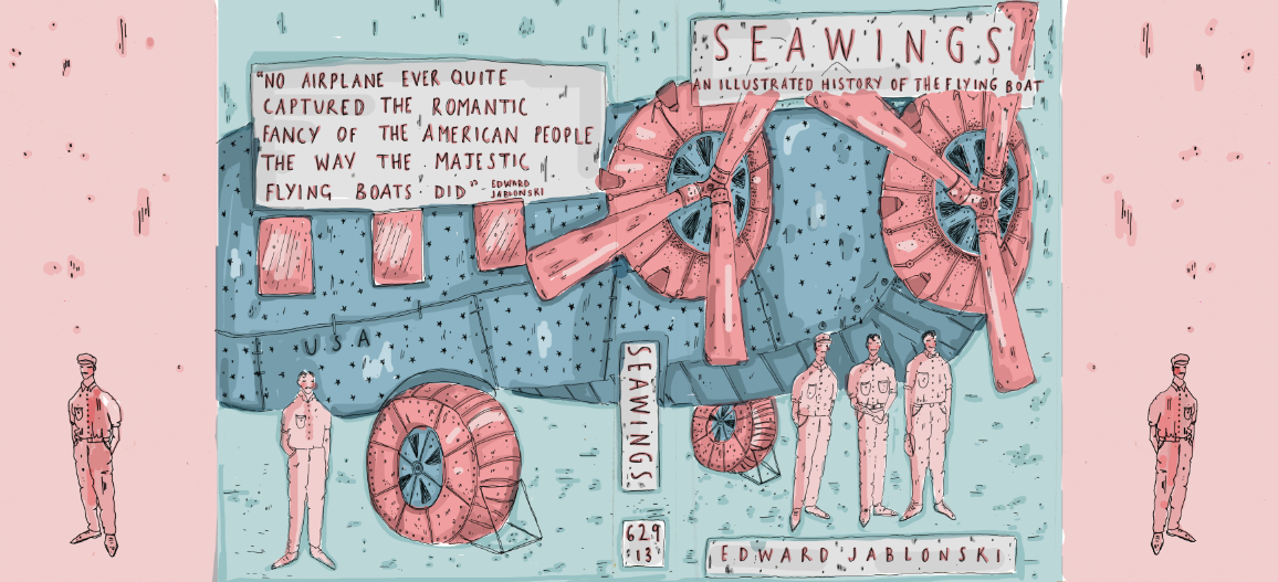
I feel that I could have worked more on the illustration of the plane as this is a subject that I haven't approached before and I could have definitely worked more on the proportions, sizing and angels of the structure.
I am really happy with the colour scheme but I'm unsure as to whether the palette suits the tone of the book, I tried to get across the idea of a nautical theme but I don't think this comes across very well at all and instead looks almost too 'cutesy' and shiny which I am not a great fan of.


What would I of done DIFFERENTLY?!

I would have also experimented even more with different colour schemes and potential layouts that would possibly be more effective?
I would have probably made the title more central and made a bigger deal out of it as I feel that at the top it is slightly out of the way and through my research I found that it should be central and I ignored this aspect which I definitely shouldn't have.


Overall I am fairly pleased with the cover but I definitely think I need to improve on my photoshop skills.
No comments:
Post a Comment