

Notes From Presentation
- Minimal and dynamic results come from flat colour,
- Hard graphic edges and a minimal aesthetic.
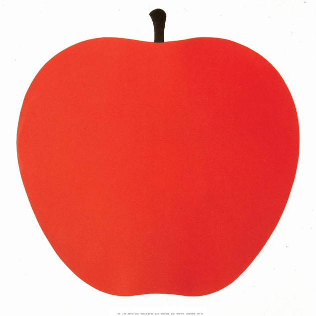 |
| Enzo Mari 1963 |
- Often used in a commercial context because of its universal and immediate visual function.
Shape is something that I haven't previously considered a strong element in my work. I often overlook the basic form of objects and subjects and begin to draw the details and marks on the subject i am drawing. I think learning about illustration in its most simple form is something that is very important and relevant for me.
 |
| Luke Best |
 |
Marcus Walters
|
I am so excited by these pieces by marcus Walters. The overlaying of the shapes and blending of the colours, offers an element of pattern and detail without being overwhelming and too crowded. The way that the lines break the shapes down really draws me in. I would like to experiment with this look myself, particularly in my other practises such as screen printing or mono printing when I get the chance.
No comments:
Post a Comment