Rainbow
Showing posts with label OUIL503 STUDIO BRIEF 2. Show all posts

Thursday, 23 March 2017

Responsive Collab - YCN Design Boards and Submission

Following on from the completion of the cards and brief as a whole, the graphic designers in my group went ahead and created the design boards to submit to YCN. 

I think the main thing that I found by working in a group that it was just less pressure as a whole, although when creating the illustrations I felt the pressure of time management and being able to finish tasks that I had set myself in terms of finishing things for the rest of the group. 

In terms of work load, I felt that towards the end of the brief, the work load was fairly distributed when the graphic designers in my group worked on the aspects such as the text, research and elements such as the design boards intended for submission.


Although I didn't have much contribution towards the design boards, I gave some input towards the text and ideas within the boards. I really feel that the graphic designers were able to use their practice to go towards creating sleek and profesional looking boards that display our work in a clean and appropriate way.

SUBMITTED!

Finally! We have submitted! I'm so so glad I have completed the collaborative side of responsive, from the very start when I was worried that I would find the experience stressful, I feel so nicely relieved that I found a group that were determined and in some ways like minded in the way that we wanted to produce work and have motivation to create the work for the YCN brief.

Initially, I found it difficult to adjust to the way that we both came with ideas and worked together, I've found that in the past I seem to have a very specific way of creating and making work, however seeing how students on a different course go through the design process and come up with ideas and research, I feel that I have a new vision of how I could possibly apply more background research both primary and secondary into my work.

I found it really interesting in each group meeting to not only get feedback but see the progress of the graphic designers and look at how they have been creating work as a result of our joint research. I loved being able to combine our practice and see how the final pieces have turned out as a result of three designers, this has been a really successful experience.


Monday, 20 March 2017

Responsive Collab - Final Photographed Images and Design Boards

The back design of the cards
My input: 
  • Illustrations
  • Colour Choice
  • Small input for use of typeface and composition.
  • Input for finding information and research for facts

The design of the concertina style collectable that would be sent away for and received as a prize.
My input:
  • All illustrations and colour choices 

The front design of the cards.
My input:
  • Illustrations
  • Composition
  • Colour Choice


Overall I'm really really pleased with the final products, a member of my group knew a bit  more about the photography and lighting studio so was able to photograph the final cards and concertina book to a really high standard.

Looking back I think as a group we worked really well together using our different skills and abilities to be able to create the final products.

I do feel that I have done a lot of the work in terms of the illustrations and in terms of the front of the cards, I have done all of the work, however, I'm glad that I had the whole group including graphic designers to give me support including their opinions.

In terms of working in a group, I have found this experience very difficult in the past, however, this time I feel that we all had an equal desire to do work and do well when creating the products. Sharing the work load, especially ideas and research was really helpful and a great opportunity to be able to come up with design choices.

Tuesday, 14 March 2017

Responsive Collab - Final Designs

Following on from the group crit, as a collbortatiove group we discuss our time limits, this was a big issue within the whole brief, we all have a lot of work from other modules and wanting to put a lot of thought and effort into this brief used a lot of time and consideration towards the others.

Following the crit and the print out of the previous initial designs, we discussed that the cards needed space around the illustrations yet still needed to work to use the idea of each card joining up as set.

I also had the idea of using the 'bear' logo within the scene as stated on the brief, but in a less conspicuous way as a bubble, almost as another element to add to the scene. My group really liked this idea and I added it in as an addition to the background of the main images.

We worked as a group and played around and experimented with adding different borders, colours and shapes around the illustrations until we were happy with the outcome of the front images. 

FINALLY, I was pleased with the outcomes, at this point I felt that I had done the most I could do within the collab in terms of my practice. The backs of the cards I mainly left down to the graphic designers, they used some elements of my illustrations from the fronts and started to play around with how to improve the use of type, layout and composition in terms of the graphic side of the brief. 

Although i had some creative input to this factor, I felt that I had done a significant amount of work for the front parts of the cards, therefore allowed the graphic designers to create this aspect between themselves.

Overall I'm so so pleased with how the fronts of the cards have turned out, i think they look really
  • Clean
  • Fresh
  • Profesional
  • Delicate, yet in a way that appeals to children and is something different to the illustrative style that bear usually approach.
I'm glad that I didn't change my way of working to appeal to the YCN bear brief, they used a lot of thick shape based imagery and I just don't feel that this looked very approachable or visually pleasing, even for children. I feel that I have approached the design in a completely new and individual way, I'm proud that I was able to do this!

I really like my use of colour, I feel that this has been improved so much and especially for a professional student brief such as YCN, I feel that taking elements such as colour and composition into consideration is really important when it comes to the standard of work being created. 

Friday, 10 March 2017

Responsive Collab - Group Crit

Following on from the initial creation of the cards, as a group we felt that it came to a point where we needed outside input into the general appearance of our designs and how we could improve and work on them towards creating the final designs that will fit the brief and stand out among other entries.

In the crit, as a group, we shared our work so far and gave a summary of how we have reached the point we have so far in our development. We ran through the theme of the project and how we thought it was an original and exciting concept to explore within the cards.

It was really interesting and helpful to hear from other illustrators, animators and graphic designers within the crit and explore how everyones different methods and ways of working can help improve my own practice.

Although the collaboration isn't over it, I really feel that I've already learnt alot in terms of listening to others concepts and re creating them in my own practice, it's so helpful to share ideas and learn from eachother.

Feedback from the crit:


  • The cards work well and fit as a theme
  • If you use the coloured background of the cards, you could change the tone of it based on how deep in the ocean the animal is found, this will make each card different and unique yet still work as a collection.
  • Using a similar colour scheme for the illustrations and the top trump style bars really works and creates a consistency to the design and also the use of colour.
  • Adding a patterned background would give the cards more dimension, they might seem a little flat otherwise.
  • The typeface in the speechbubbles could differ and suggest a different voice for each of the fish characters.
  • for the concept of sending off the cards in order to receive a free gift, perhaps it would make more sense to send something else off so that the children could keep the cards.
Overall the majority of the feedback was very positive, we were able to get a general idea of the feelings towards the cards.
There wasn't too many negative thoughts which was a really positive thing to come out of the crit. 
I'm really glad that my illustrations got positive feedback, someone even said 'professional and clean' which made me feel really confident with my designs, especially as my work is affecting the rest of the group!

NEXT STEPS
  • Really refine the final designs, think about the feedback given and start to tweak each element.
  • Meet with graphic designers and consider their actions and see if I can give any creative input to their practice aswell.

Monday, 6 March 2017

Responsive Collab

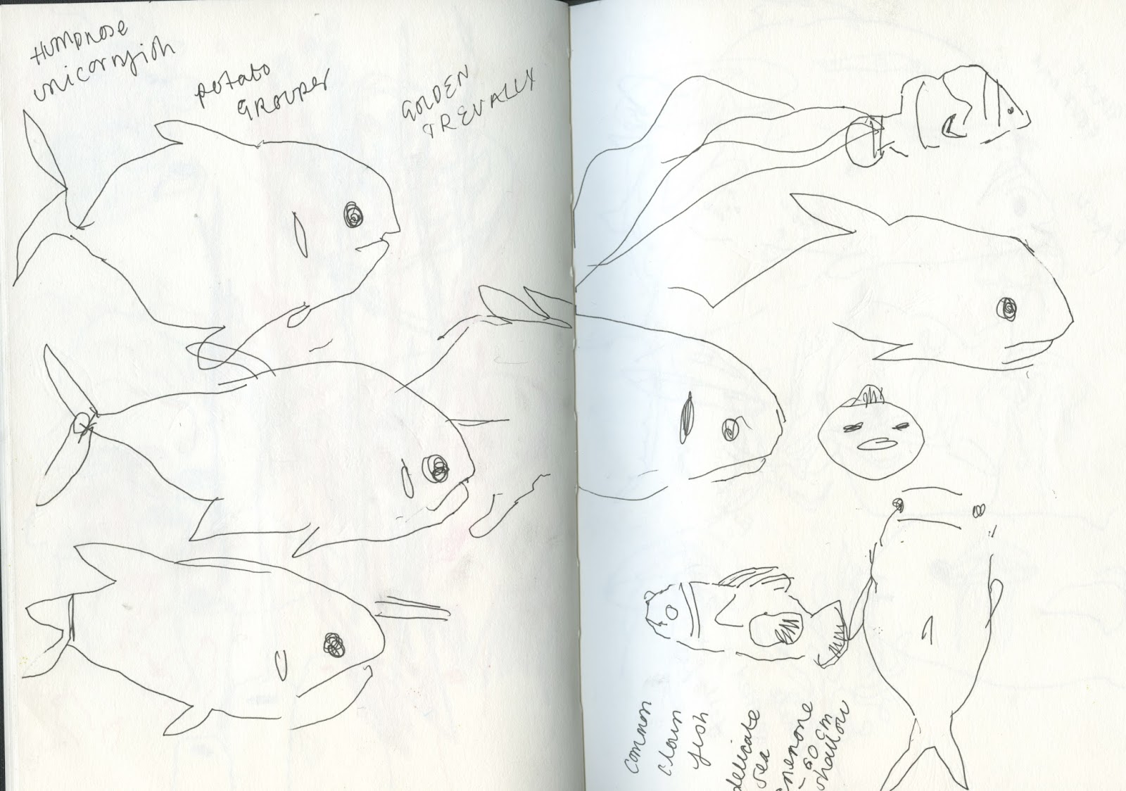
Following on from my meeting about the initial designs, I began to create the potential finial designs for the other nine cards.

At some points, this process felt like a lot of work for me to handle alone, but at the same time, I really felt that I had a vision and I wanted to make sure that it worked well and successfully alongside the designers ideas for the text and graphic elements within the cards.

We have been meeting a number of times as we felt that more casual meetings rather than organised group discussions were a lot more relaxed and allowed our ideas to work and stream together more easily.

I designed the cards in a similar way to the initial shark design as, previously discussed, my group felt that this was a successful and approachable appearance for the children when looking and collecting these cards.
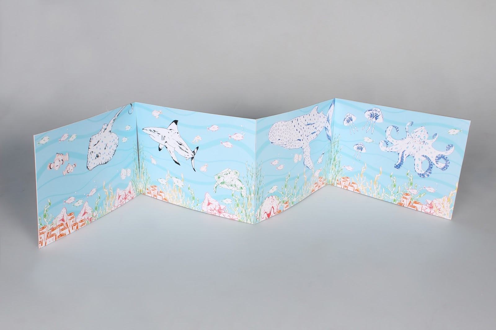
We began to consider how we could link the cards up as a concertina style piece, one of the graphic designers sent me some sketches that could be a starting point to begin to consider the linking aspect of the cards.
Although just a quick sketch, I found it really helpful to have the input from another designer. She described how the coral and seaweed could be the linking factor between and the cards and allow the separate segments to be able to link together and join ideas.

Following on from this, I began to add the seaweed onto the designs, a simple step but it opened up a whole new aspect of the design process. 

At the point I felt that the designs were finished enough to hand over to the graphic designers, even if they still needed a few tweaks and extra steps to be completed in terms of the outcome.

The two graphic designers started to add the backs of the cards, looking at the text and information and how they could be incorporated to the illustrations, working around them.

 The graphic designers came up with a number of designs and concepts that we could potentially use and play around with when creating the final designs.

I found it really interesting to see the process of a different course and how their use of programmes such as indesign and illustrator made a progress that I find fairly difficult look fairly simple. I feel that through working together I will be able to gain a better understanding of this progress and maybe even be able to incorporate this way of working with in my own practice.

I particularly liked the use of the bars within the back designs. A top trump style design that will appeal to children and make the cards a part of a game that they will be able to play with their friends.

NEXT STEPS

  • Our next steps as a group will be to receive feedback and consider how we can change the designs based on the feedback. It will be interesting to get the feedback from another group that have similar interests and design process'.
  • We will need to work as group to add the adjustments needed and continue with the practice so that we will be ready for the deadline of the competition.


Thursday, 2 March 2017

Responsive Collab

Following on from the initial design concepts taking place, I met with my group to discuss my first designs and how they thought they could be effective in terms of adding the text and taking the designs further to appeal to the target audience of children.

They felt that the designs were really successful, both the graphic designers said that they really liked the use of colour, used in a simple yet effective way. 

The detailed illustrations were something that I was concerned wouldn't work but the designers really liked the contrast of my designs to that of the other cards that have been made previously.
I made rough versions of the other animals and looked at the colours that I could potentially use for the cards for them to be featured on.


As discussed in the group meeting, my main aim for the next meet will be to have finished the illustrations. The concept within each piece is fairly similar so I really don't feel that this will be an issue to get this done in time.

I'm really enjoying working in this group and collaborating with graphic designers. I feel that it's really enhancing my practice and improving skills such as time management, I'm feeling pressure to finish tasks on hand by a self set deadline as my actions will affect the others in the group.

NEXT STEPS

  • Place each of the animals in a scene much like the scene with the shark and see how the way that the colours and other elements such as coral and be re worked for the different creatures.
  • Discuss with my group how they will use the design and text within the cards and think about how they can run alongside age images. I don't want to overcomplicate the images as I feel that the text needs to be the main aspect of the cards. Particularly as the facts need to come across clearly and directly to the children reading them.

Friday, 24 February 2017

Feedback so far

During the crit I was able to get a strong understanding about the thoughts towards my work so far, it was really helpful to know the standard of work that I was creating and to understand whether I should continue to work in the same way.
General Feedback

  • Strong use of colour throughout all of your responsive to briefs, you have used this effectively i order to respond in the most appropriate way.
  • I love the moby background, it's interesting to see you working in a digital media.
  • Really strong use of screen printing techniques within your album covers.
  • I like the concept of the moby design but I feel that you could have used some more textures and skills within photoshop.
  • LOVE the foiling on the album cover.
Overall the feedback was really helpful, it enabled me to understand the direction in which my work was heading and get a feelings towards the general response to it. 
It was quite a positive session and I feel that it enabled me to have the confidence to continue to work in the way in which I have been.

Wednesday, 22 February 2017

Responsive Collab

After consideration and discussion with the group, I have decided not to include a character of the bear within the yoyo card. This isn't an exact specification of the brief but at the same time, alot of their other cards have the character as a feature of the cards.

I did start designing a few bears to have an ideas of how a bear could work underwater but I feel that it's slightly irrelevant and doesn't really have any relevance to the story and narrative that we are trying to tell in the brief.

However, I was quite pleased with my bear designs and I was happy that I got to practice my character design as this is something that I really want to try and improve on.


Responsive Collab

I've started the process of places my drawings together to create the designs, I'm enjoying playing around with moving the different pieces on the screen as opposed to on paper, which is the process that I normally do.

 The most exciting and innovative steps that we have taken in recreating the cards for the bear brief are as follows:
  • Having the cards all link up in some way and correspond to eachother to create an exciting fold out poster that the child will be able to hang in their room. This is something major that I will need to take into consideration if I want to make this idea work. I'll need something in the designs that corresponds to each card so that they are able to line up in any order!
  • We want to use foiling or something visually interactive in some way, we felt as a group that this would enhance the designs and make them visually exciting for the children to be able to play with.

Tuesday, 21 February 2017

Responsive Collab - Refining drawings.

 Following on from my visit at the deep, I thought it would be helpful to refine my drawings and scan them in, in order to see all of the pieces that I have to work with.
I find working in this way very helpful, particurly in terms of working within a group. I was able to show my group these two pages and drawings and we discussed how each element could work together to create the different yo yo cards.
I'm so glad that I was able to collect all of these drawings, it will make it alot easier and faster when it comes to creating the cards, they will almost act as 'stock' images that I can transfer and use within the different cards.

My group seemed really pleased with the illustrations and we began to discuss specfic creatures and narrativs to focus on within the cards. Following on from their research they listed:
  • Blue Spotted Ray
  • Blacktip Shark
  • Green Sea Turtle
  • Whale Shark
  • Clownfish
  • Great Clam
  • Big Box Jellyfish
So far I'm really pleased with how well we're working as a team, I feel like they are giving me a good motvation to do the illustrations for the breif and I feel confident that they will create a great graphics basis to work alongside my drawings.
At the end of the breif I'm hoping that we will all work together to adjust the details and refine any other elements to really use this idea of working together as oppose to me just doing drawings for them to add the text.

Following on from our meeting, I began to sketch out some images of the chosen creatures in order to get a head start on designing the cards. Time restraits do slightly stress me out but I feel that with working with a group I have the motivation to do more work as it's not just for me but for the rest of the group aswell!
 I'm so so pleased with how these drawings have turned out. Although I had to sketch them from online resources, I'm really happy to see how my basic drawing skills have developed! I will need to begin to consider how I can transform these images into a more child friendly approach to fit in within the bear brief, however so far I feel that I've made a really successful start!


Thursday, 16 February 2017

Further Research


Following on from my research at the deep, as a group we began to explore the previous designs on the existing bear cards.
We purchased a number of different themes and discovered the use of different:

  • Layout
  • Style of illustration 
  • Colour
  • Size of Illustration
All of this information was useful to know and understand when it came to considering the design aspects of our own cards.
As I looked at more of the cards I found that a lot of these designs consisted of large block colours and shape based illustrations. This really isn't something that I'm used to working with and is potentially something that I would struggle with when it came to creating my own illustrations for the cards.
I began to research other card based children's products and looked at how the illustrations different when placed onto the smaller sized medium.

CIGARETTE CARDS
Although not intended for children, the illustrations on the small size of the old fashioned cigarette cards are detailed and full of small marks and a lot of colour. I think this element of them goes to show that the size of the card doesn't matter, the fact that the person holding the card owns it and will hold and study it, is something that I have to keep in mind.

Perhaps it doesn't matter how detailed the illustrations are, but what matters is the story and characters within the card.

POKEMON CARDS

In contrast, these pokemon cards, designed for children, still have a lot of detail and colour within them. The box for the illustrations is even smaller yet they still have a lot of detail and elements within them that add to their quality and use for children.

Much like the bear YOYO cards, the text and divide between the illustrations and information adds to the use of the card and adds interest for the children to learn and discover.

I think the use of character is so important, especially when appealing to children. If the character is relatable, the child is able to connect to it and want to keep it, and in terms of the YOYO cards, hopefully find more of the sea creatures and thus buy more products.

Overall I'm feeling more confident in terms of being able to create the illustrations for the cards. I worried when I saw the shape driven designs of the other cards and felt that I wouldn't be able to create the pieces to a similar standard.

My NEXT STEPS will be to discuss with my group about the style of design that i am considering and get any feedback they may have, along with discussing the potential facts and text that we could include for the back of the cards.

Wednesday, 15 February 2017

Responsive Collab - The Deep

 Following on from the collab meeting I thought about collecting first hand imagery to draw from for the yo yo cards. I felt like from drawing from life in my initial drawings, I would make it easier for me to make the drawings more appropriate for children in the sense of applying them to the Yo Yo cards.
I found that the deep was also aimed at children and familes so it was a good point of research in terms of looking at what exhibitons the children enjoyed most and using this research to create more exciting and refreshing designs for the cards. 
I really loved the bright coral and the interesting popping colours, I feel that I could really use this well in terms of making the cards exciting and making them something that is to be collected and admired.
It was really great to see the fish in action rather than drawing a flat design on a screen, I found that as a result of this I was able to get a better sense of their movement and their effect on the surroundings as they are moving around in the water. This will defiantly aid me when producing my drawings for the cards.

NEXT STEPS
  • My next steps will be to show the group my research and begin to plan as a group what potential aspects of the great barrier reef we will be exploring. It's important to keep this communication going and learning off eachother in terms of idea generation.
  • I need to refine these drawings and begin to consider how I could potentially use them in the sense of a yoyo card!
  • I'm really excited by the imagery that I've created and I feel that I can create some really effective work based on this!