


Overall I am fairly happy with how my final designs for the newspaper article turned out. Through experimentation and roughing I was able to create designs that I am pleased with and have planned and sketched thoroughly in order to achieve the look I wanted.
Throughout the designing process I struggled with the idea of layout and how I could use the size criterias well in order to best achieve an effective narrative illustration.
My feedback from peers said
- "I've seen that lots of work and consideration has gone into the production of these final pieces. Material and colour have been experimented with and changed throughout and I think that the final pieces have benefitted from this"
- "A negative is that it could benefit from processing the images digitally."
I agree with my peers comments about using digital media in order to enhance my images. I really want to experiment with this technique in order to soften out my work and in some ways make it look more professional. However, saying that I still really like the hand drawn element of my work and the digital aspect could take away from this in some ways.
Comments about design and image include
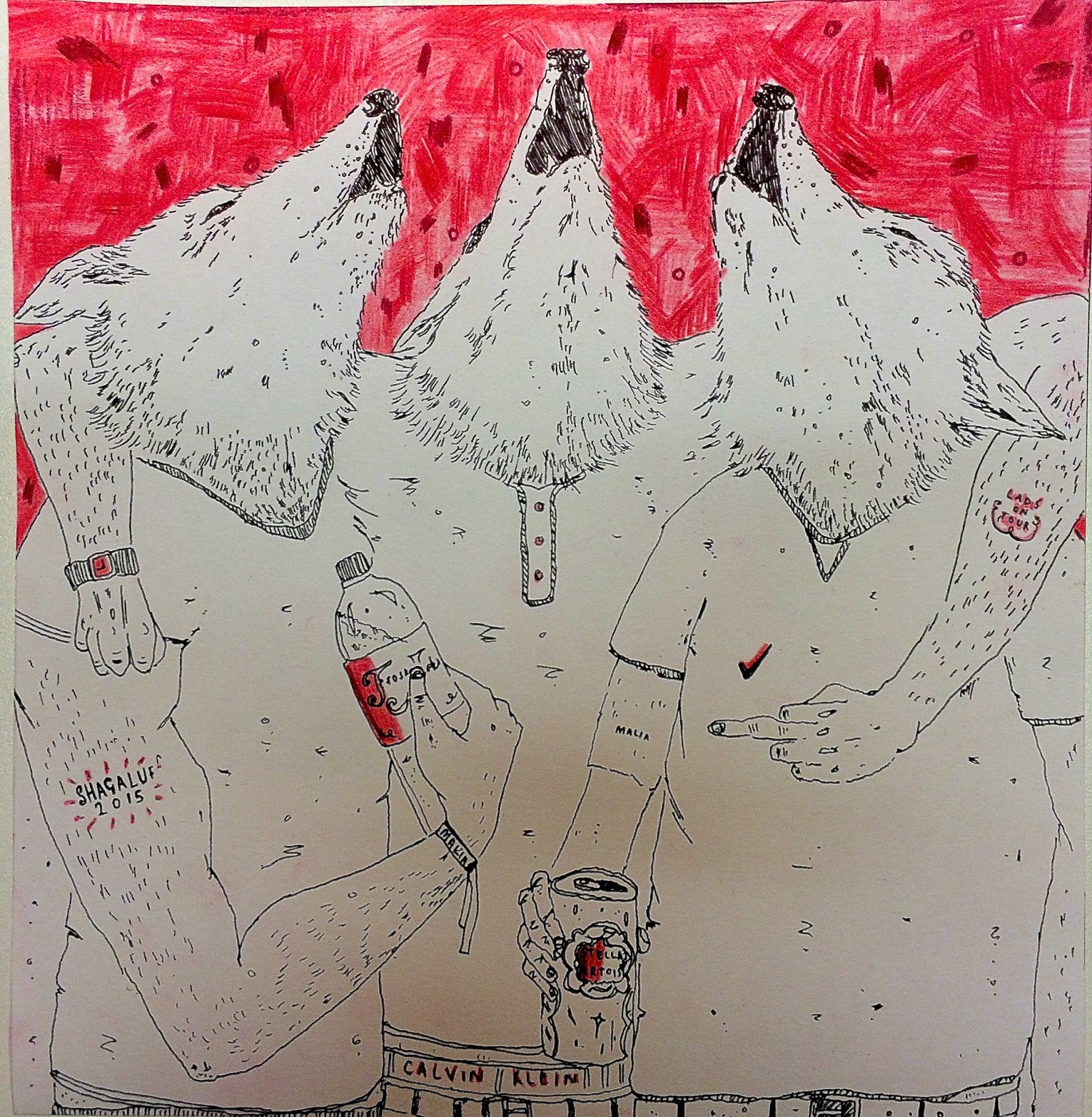
- "Great composition. The colour helps balance the image and make important elements of stand out. The pieces work well within the dimensions and uses negative space well. The details help tell a story"
- "A negative is that I'm not sure about the darker spots in the background, they distract from the main focus a bit, but I do like the aesthetic"
 I agree with the comments about using the negative space, I planned this out in experiments using different mediums and it helped me come to the conclusion that this would be the most effective method to use.
 However, I disagree with the comments about the background marks, through experimentation I felt that they helped represent the idea of being drunk which is essentially a large part of 'lad culture'.

- "Great concept using wolves as characters and depicting them in 'LAD' scenarios. I knew straight away what the theme was and I think the images alone without the article tell a story"
- "A negative is that you have used words in the t-shirt and bodies of the wolves, however this somewhat adds to the images"
I am very happy with my feedback from my images and after discussing with peers I found that my most successful image was the 200 x 200mm as I feel that this is the most successful image in terms of displaying my message.
If I were to do this work again, I would probably look more into the digital aspect and maybe experiment more with different scenarios that I could have placed the wolves into.
No comments:
Post a Comment