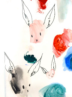
Following on from the creation of the bunny character, I feel like I needed to develop him further, looking at head movements and body actions as this is definitely something that I have struggled to keep consistent in the past. I started by just drawing out the head shape a number of times and then drew on the features. Again, this idea of repetition of the head gave me lots of ideas that I could potentially use for the gif. The idea of seeing him in different forms and facing directions allowed me to see what he could possibly look like. This is definitely a helpful process for me.
Following this, when I was happy with how I would draw out the head and face features, I began to think about what colour i could use, if any. I think that because I want to keep the idea of him subtle and quiet, i don't think that too much colour is needed in order for him to effectively communicate the idea and message. I really like the lighter pastel tones, particually the blue as that can communicate a shy and quiet emotion and contrasts particularily well with the red if I were to give him red cheeks as a sign of anxiety and stress.
I found laying out all of the colours like this really helpful as it gave me the chance to analyse how each of them would effect the mood and appearance of the character in different ways.
After experimenting with the clothing colours, I looked at how I could apply these on the clothes themselves.
I definitely think that the pastel colours work well with the message that I'm trying to achieve. Before committing to the final design I decided to experiment further with different ways that I could create the character himself as oppose to thin pencil lines, I could use colour or a different medium, I want to explore how this will effect the outcome.
I feel that the colour pencil creates a joyful and almost childlike appearance, this isn't the type of emotion that I want to create in my gif and I feel that if i went ahead with this medium that it would take away from the message that I am trying to convey.
I have experimented by using colour pencil and a more textured and detail approach, although I like this drawing asthetically, I feel that again it doesn't convey the message that I am trying to with my character.
Finally, I looked at drawing the character in the same way just with a thicker line quality. Again, although I like this drawing aesthetically, I feel that the thicker lines make it less subtle and shy which isn't the look I'm trying to achieve.
I feel that I have done enough development in order to start creating the final ideas for my character and begin making my gifs.


No comments:
Post a Comment