Rainbow

Wednesday, 24 February 2016

Viewpoint Presentation


What do we mean by depth of image?

  • The creation of the illusion of distance or a third dimension.
  • Overlapping and using different sizing and scale.
Is depth only relevant to people who want to make realistic images?
  • depth is relevant if it works with the narrative and composition of the piece.
What is line of sight?
  • the direction in which our eye moves when looking at the image.
What does line of sight do for the composition?

  • draws your eye around
  • gives the image movement


This image by Mobius, for me, completely defines the idea of viewpoint and depth of field. The way that the image and line of sight follow through creating a pathway that guides the viewer through the image is so effective and really inspires me to focus more on viewpoints within not just visual language, but other briefs aswell. The way that the contrast between the bird and the edge of the cliff create an X shape also is such an effective aspect for me. Everything about this image just draws me in and inspired me within my own practice!


Monday, 22 February 2016

Final Three Gifs

Final Three Gifs
Overall I am fairly happy with how the three gifs came together. I feel that I have considered the way the character works and looks on all of the platforms. I think that my extensive planning and character development really helped with this element. I have really enjoyed this brief, particularly the making of the 3D gif and having the chance to expand my work onto other mediums such as clay and textiles.
I definitely think that if I had had more time I would have worked harder on the planning of the narratives of my GIFS and looked at how the movements can change the way mood and way emotions can be shown.


Saturday, 20 February 2016

3D GIF

Shy Bunny Boy in Three Dimensions! 
I am really pleased with how the final puppet has turned out. I have had a bit of experience before with making three dimensional figures but I feel that this is my best attempt yet. I really enjoy stepping out of my normal 2D comfort zone and making something that you can physically hold, i think it really adds a different quality to my work. I really like how my detailed line work that I find myself doing can almost be seen in the figure in the painted details, I think this is something that really ties all of my GIFS together as a set.

ISSUES!
I'm slightly worried about how I am actually going to make this into a gif as I feel that because of the limbs being so unpredictable and wobbly, it will be hard to keep it consistent. I will look at how I could potentially film it and then make the video footage into a gif rather than actually doing a stop motion style much like I have with the other two gifs. 

I chose to have a white background when I filmed the Gif, I felt that with any other colour it might overcomplicate it and take away from the actual puppet itself. I like the fact that the white compliments the pastel and subtle tones of the puppets clothing and body parts, I think that I have considered all of this very well.
I really enjoyed making this gif and seeing the puppet come to life in the footage was great to watch.
I experimented with lighting and different tones in order to see what different effects and moods it gave to the puppet. I looked at if I could potentially use black and white in order to change the atmosphere, I thought it could maybe make it seem melancholy, however I feel that the black and white adds a haunting element which isn't the mood that I was going for in the gif.
In terms of the shadow and lighting, I wanted to keep the gif quite simple and clean, therefore I don't think the use of dramatic lighting is needed and in some ways it takes away from the feelings of being shy and feeling awkward which is the running theme through my GIFS.

THE GIF
What I like?
I really like the way I have taken my work and translated it into a three diminutional form, I think this really adds another level to my work and I feel that it has worked very well in terms of the series of Gifs. I think that I have considered the clothing and weight of the limbs and size of the body parts including proportions and shape, I feel that the each reflect my other gifs and my initial character design, this is something I'm really happy with. 

What I don't like?
I'm not very happy with the actual gif itself, I found it difficult to move the puppet around and therefore it was tricky to suggest the emotions of being shy and anxious, however looking at the exaggerated hand gestures that the puppet is doing, I feel that it could potentially represent the inner feelings of anxiety, the feelings of stress and panic. I struggled to choose a section from the video that I took of the puppet but the part I chose I liked as he seems to turn in both directions, almost frantically looking around for help. I also don't like the fact that I had to reduce the quality of the video a lot in order for it to work as a gif, however this is a technical issue but is definitely something that I should have considered when choosing to make the gif as a video beforehand.

In the video that I took I tried to make the puppet have as many gestures and actions as possible to show the puppets features but also convey emotions of stress and panic. This is a short clip, the full length video was over 2 minutes long so that I had a wide range of footage to choose from.

Thursday, 18 February 2016

Creating the 3D gif

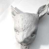
For my three dimentional gif I wanted to create a puppet version of my character. I was really curious to find out what he would look like in this format and I felt that this was the most effective way possible to create the gif in a 3D way. I used air drying clay to most the face and each body part. I have worked with this before and I really enjoy physically shaping and forming something especially when it is something thats only really viewed in a 2D way before.
I was pleased with how the head turned out, however I would have probably made the ears slightly bigger to be the same as the drawing, but due to restrictions of the media, I didn't want the ears to break as a result of it. I felt that I was successful in replicating the face of the character and translating it on to this different platform.


I decided to make the limbs and hands and feet of the puppet easily moveable and that I would attach string to them to make him move, I felt that this was the best way possible to animate him as gif without having to move him about too much by touching, which could potentially ruin the continuity of the gif.

When it came to painting the head I felt that I wanted to add a bit of colour in a similar way to the digital gif as I felt that if I continued with the colour scheme of the hand drawn one that the white might get lost in the background that I was going to use of the gif and the facial features might not have been picked up. I am pleased with how the painting of the face turned out and I feel that I have used shading and tone well in order to shape and construct the face.


When it came to putting the body together, I struggled to construct a shape that would easily stay upright and together without looking too harsh and dramatic, because even with the puppet, I was still trying to convey the awkward and shy approach. This is a particular reason why I created the limbs so thin as I think it adds to the delicate and gentle appearance.
I used felt to make the clothing of the puppet, I felt that its soft texture would add the element of being fragile and shy and i think the white compliments well with the pale skin.


Wednesday, 17 February 2016

Wes Anderson - Fantastic Mr Fox


I am feeling really inspired by the Wes Anderson film 'Fantastic Mr Fox'. I was initially struggling to think of what format I wanted to create my 3D GIF in but after watching this film I feel inspired and excited to recreate my character in a three diminutional puppet format. 
I am intrigued by the movements and slightly awkward nature of the puppets and figures in animations and gifs and for my character in particular i think that this would work really well in conveying the emotions of anxiety and awkwardness. Due to time restrictions I won't be able to go as detailed in my own puppet but I will try to recreate the shy bunny boy to the best of my ability in a 3D Form.
Puppetry and figures is definitely something that really interests and excites me, I would love to learn more about it and potentially work more with it in briefs in the future.

Tuesday, 16 February 2016

Digital Gif


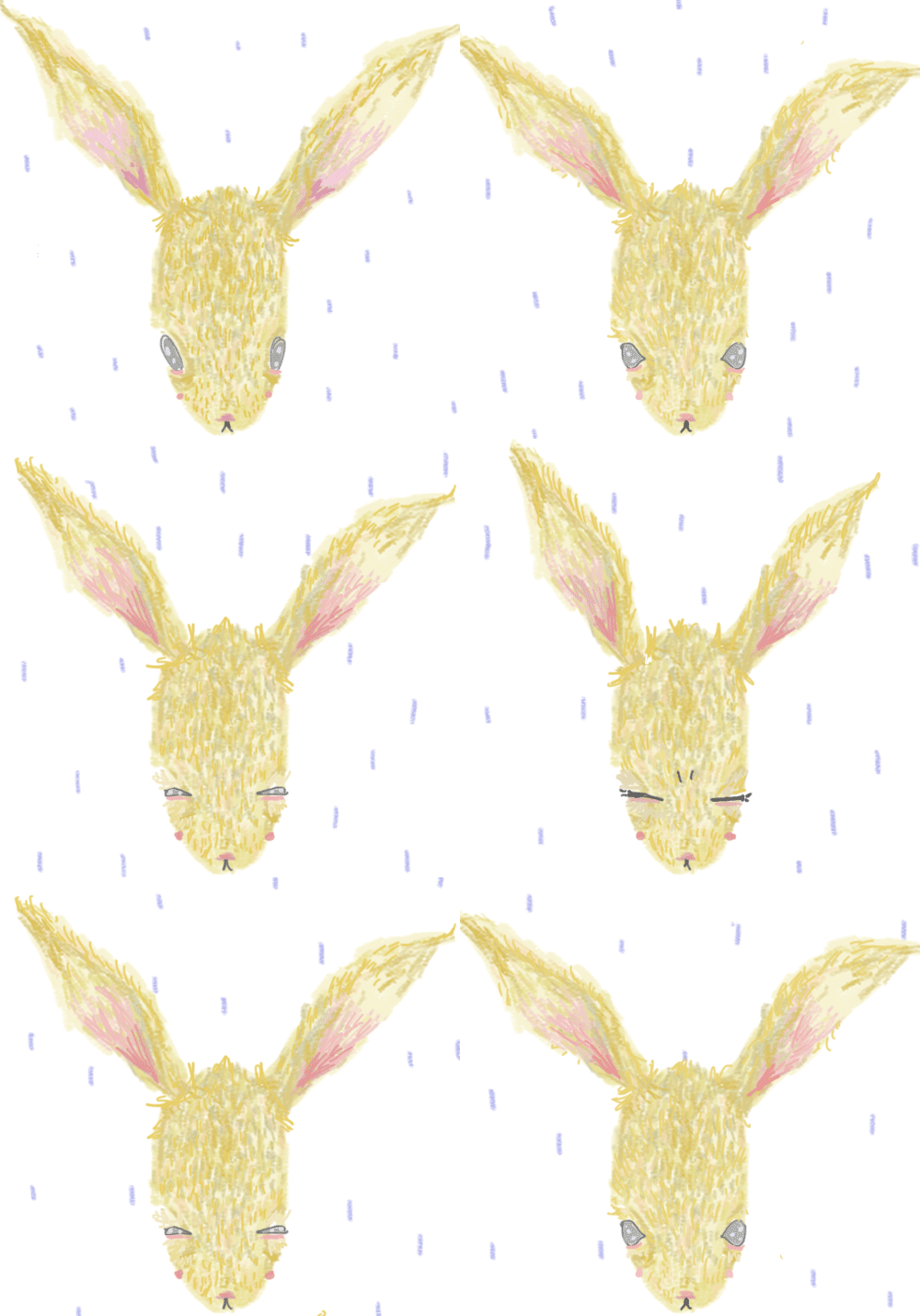
 I had been putting off the idea of doing the digital gif for a while just because I felt nervous about using purely photoshop to create work as I have never done this before, I have only ever used it as a tool to assist work that I have hand drawn. I started off by drawing this character, however I felt like when translating it in the same format to a digital way it really didn't work in the same way as it did on a hand drawn way. It looks almost as if its designed to be 'cute' and not so much shy and coy. I began to look back at my other experiments and felt like the colour pencil drawings could potentially work when translated into digital format, particularly the one where i have attempted to use texture and more detail.
Following on from this, I looked at how translating this to digital format could be a good way of adding the textures in a more simple way. I thought about different ways i could animate this, and the idea of the fur moving seemed like an interesting concept to me. Again, I wanted to create something subtle to show the shy and awkward nature of the bunny boy character so I considered the idea of slowly blinking something that could potentially show the character in a different light compared to my hand drawn gif.
I really struggled with the digital gif as I could understand the different layers and how they corresponded with each moving image but after practise and planning i was able to work out a method in order to make the gif consistent and smooth.


When watching the gif through for the first time, the white background seemed to stark, I felt that it needed something to enhance the characteristics of the shy bunny. I added the rain in order to give a subtle effect of feeling anxious and nervous.


What I like?
I'm really happy with the way that I have animated this gif, I think it works well and is smooth yet subtle in the way that he blinks with the rain gently falling. I really like the line texture and the way the fur and ear colour is animated, i think that I've done this well.

What I don't like?
I don't feel like the character works well in terms of translating it on a digital platform, I don't think i have followed through the same method and ways that I used to create my other gif and Ihavent really followed the way I developed the character. Despite this I still feel like the character works in conveying the emotion but i wish that it still looked at the way the character has its own qualities. I also feel like the gif goes too quickly in order to show the feeling of awkward, I think that if the rabbit blinked more slowly and the fur moved less frantically then it would have portrayed the emotions better.

Sunday, 14 February 2016

Hand Drawn Gif


 After creating my final character design, it was an easy transition into creating the hand drawn gif. Before starting this task, I knew that animation took a long time and was very repetitive, but I don't think that I had prepared myself for the massive task that it actually was. Despite this, I did enjoy watching as my gif developed slowly. I found it quite difficult to keep it consistent and often found that certain body parts of the rabbit would change which I found frustrating but i tried to let it flow as much as possible. Initially I thought about keeping the character monochrome just because I thought it would be better to keep the lines consistent, however once I had embarked on the coloration, I really liked how the texture was coming out using the colouring pencils.
Overall I had 23 frames, the idea is to show the character looking awkward and somewhat frustrated with his shy nature. His cheeks go red and he blinks as his ears twitch. He moves his feet and fidgets with his hands. 

What I like?
Overall I am really pleased with how the gif turned out. I think my extensive character planning really payed off as I feel that he really has his own personality and emotions. Although it was unplanned I think that the tracing paper texture in the background really gives that other hand made feel about it which adds to the shy and awkward feel of the gif, I'm really happy with this.

What I don't like?
If I were to do this gif again I would probably consider using a light box, because although I have said that I do like the tracing paper background I feel that it could have been more effective if it had been a solid white. Also, if I used a lightbox I feel that I would have been able to keep the head and body the same as I have noticed that they seem to change shape as the gif rolls, which is something that I didn't plan.

Friday, 12 February 2016

Frame Task

Before starting the frame task, i began by creating a series of roughs that would explore the way that i can use frame effectively using the whole frame to its full potential. Roughs are definitely very important when it comes to creating something such as frame as its important to consider a variety of ways that frame and composition can be used to create the most effective image.
i think that this frame works well as a whole, I'm looking at symmetry and the sizing and form of the objects.

im not sure about this frame, i feel like the composition doesn't use the frame to its full potential. the butterfly seems out of place and almost an after thought, however, I'm happy with the line of sight from the trunk to the person in the air.

i don't think that this composition uses the frame very well. i can work harder to create a better composition that uses the whole frame effectively, again the butterflies seem like an afterthought, i think because they're small i haven't really considered their placement on the page.

in this rough, i have combined the line of sight and the direction that the image travels in order to make an effective frame.

this is thinking about the layout in a completely different way with the human being the largest and the elephant the smallest, a complete swap of roles. 

i really like the idea of thinking about the composition in a way that isn't obvious. the task to draw an elephant, human and butterfly seems clear to do but i really like the idea of going about it in a completely different way. i want to develop this idea further, however, as a frame i don't this it is as effective as it could be. 


i tried to develop this idea into something more refined, however, I'm not convinced that it is the best demonstration of frame and composition, i can definitely do better than this.

i took one of my previous rough ideas that i felt had the best potential, i have tried to refine it and make it have the best frame that it possibly can. i think the arch of butterflies definitely work and in this sense don't seem like an after thought compared to some of my other roughs. the symmetry between the elephant and the human really pull the image together. 
in the final piece, i really struggled with the use of ink in which we were required to make the piece in. i don't like the texture of it and I'm some ways takes away from the frame due to the watery nature and uncertain lines. however, i feel that through the exploration in my roughs i have been very successful with the way that i have used the full potential of the frame. in terms of sizing, and symmetry i have successfully creating the image. the butterflies almost create a frame around thee work making it work together and coherently.


Lilli Carre - GIF/Animation

I came across Lilli Carre's work on instagram and was instantly drawn to her quiet yet intriguing animations. Her work uses a range of animation techniques and styles that I am finding really inspiring in my own practise. I particularly like the hand drawn aspects of her work, and when animated they jump and move, I really like the quality of this and its definitely something that I would like to achieve in my own gifs.
Despite the slow and slight movements in some of the frames, I feel that her work is still able to convey the emotions and feelings that she is intending, this is something that i am taking away from her work, the idea of simplicity and that sometimes gifs and animations don't need to be overworked in order to be effective and translate the meaning.

Thursday, 11 February 2016

Frame Presentation

Notes from Presentation

How can we place importance on certain information in a frame?
This can be done by changing the size of the object, larger often means more important and smaller is less.
When an object is centred in the frame is often indicates importance and dominance.

What are the benefits of overlapping and how can this be achieved?
Overlapping is a good way to organise varied objects in interesting arrangements.
Not everything has to overlap.
Overlapping creates depth.

What role does frame play in composing visual information in your image?
Frame creates atmosphere.
Cropping and cutting the image down can change the way frame is used.


Laura Callaghan

  • Three women and window in same direction show the line of sight
  • The three women are the largest subjects in the image.
  • The negative space of the skin draws you in to the frame and stands out against the busy frame around them.


Tomer Hanuka
  • Line of sight draws the viewer to the womans gaze looking up to the window.
  • The line of sight also follows the raindrops as the fall past the window.
  • The colour schemeis basic and simple allowing the narrative to be easy to read.


Brian Saunders
  • the negative space of the piano creates a frame around the top of the image.
  • the size of the piano in the foreground also contributes towards this framing
  • the line of sight between the window panes and the arches of the piano draw you into the centre of the image.


Tuesday, 9 February 2016

Final Character Design


Shy Bunny Boy
What I like?
I feel like I worked hard on experimenting with different media and techniques in order to create the most effective character that conveys the message of being shy and anxious. I looked at different positions he could have as his natural stance and i feel that i have been successful with drawing this in a certain way. I looked at the different colours I could use and I definitely think that the subtle blue and white accurately portray the unconfident and wary emotion that I want my gif to portray.

What I don't like?
If I were to change anything about my character it would probably be the style of the hands and feet. I think that if I had longer within this brief i would work more on making them either more accurate or more effective as I feel that the hand-like shapes almost take away from the character itself. As I have been exploring, I want to expand on my way of drawing either really realistic or cartoony features and for this particular drawing I think I have mixed them well.

What are the next steps?
My next steps within the brief will be to begin creating my gifs, I think because my initial character design was in a traditional hand drawn method, I will begin with the hand drawn gif as a starting point. I am slightly worried about how I will translate this same character design into a three dimensional and digital form but I feel that looking back at my experiments of the bunny will assist me in this process.


Monday, 8 February 2016

Shy Bunny Boy Development

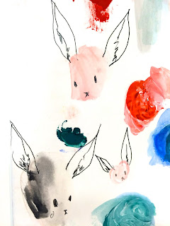
Following on from the creation of the bunny character, I feel like I needed to develop him further, looking at head movements and body actions as this is definitely something that I have struggled to keep consistent in the past. I started by just drawing out the head shape a number of times and then drew on the features. Again, this idea of repetition of the head gave me lots of ideas that I could potentially use for the gif. The idea of seeing him in different forms and facing directions allowed me to see what he could possibly look like. This is definitely a helpful process for me. 

Following this, when I was happy with how I would draw out the head and face features, I began to think about what colour i could use, if any. I think that because I want to keep the idea of him subtle and quiet, i don't think that too much colour is needed in order for him to effectively communicate the idea and message. I really like the lighter pastel tones, particually the blue as that can communicate a shy and quiet emotion and contrasts particularily well with the red if I were to give him red cheeks as a sign of anxiety and stress. 


I found laying out all of the colours like this really helpful as it gave me the chance to analyse how each of them would effect the mood and appearance of the character in different ways. 
After experimenting with the clothing colours, I looked at how I could apply these on the clothes themselves.


I definitely think that the pastel colours work well with the message that I'm trying to achieve. Before committing to the final design I decided to experiment further with different ways that I could create the character himself as oppose to thin pencil lines, I could use colour or a different medium, I want to explore how this will effect the outcome.

I feel that the colour pencil creates a joyful and almost childlike appearance, this isn't the type of emotion that I want to create in my gif and I feel that if i went ahead with this medium that it would take away from the message that I am trying to convey.

I have experimented by using colour pencil and a more textured and detail approach, although I like this drawing asthetically, I feel that again it doesn't convey the message that I am trying to with my character.


 Finally, I looked at drawing the character in the same way just with a thicker line quality. Again, although I like this drawing aesthetically, I feel that the thicker lines make it less subtle and shy which isn't the look I'm trying to achieve.
I feel that I have done enough development in order to start creating the final ideas for my character and begin making my gifs.