


WHAT WENT WELL?
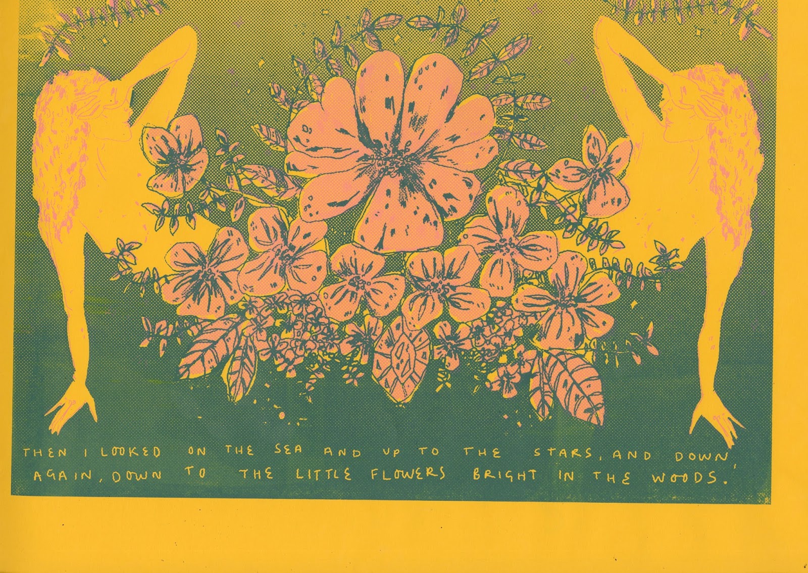
- Again, similarly to my last two prints, I'm really pleased with how the composition of this print turned out. I like the surreal mirror effect that i have been able to create through the use of playing around with the designs and images that I had to work with.
- Again, the colours that Ive used, i think personally really work well in terms of representing the idea of an enchanting scene, representing the poems of Carter. I'm so glad I found a colour palette that I'm happy to do this idea with.
- I think the quote works particualry well with this design. Compared to my other prints so far, i find the poetic element of this print particularly appealing, as it doesn't necessarily obviously depict whats in the image, but it can sit nicely alongside it giving an extra element of narration, this is something i've been striving for with all of the quotes I've chosen to include.
WHAT COULD OF GONE BETTER?
- I feel like I may have overdone the half tone within this print. It has worked particularly well within the previous prints, but for some reason, i feel like it may be slightly overdone with this print. I'll see what time i have at the end of all of my printing if can go back and change this, but i don't know what time restraints ill have.
- there are really small details within the design that i feel could have been more successful, however, as I've said for my previous designs, these are just really small elements and i feel like I'm often quite picky with my work. Although, if i wanted the designs to be completey perfect in my eyes, i should go back and change these, but again thats something to do if i have time to complete it.
No comments:
Post a Comment