


Saturday, 31 December 2016
Study Task 4 - Animated Shorts
GIF TEAM - THE GREENHOUSE
- I really enjoy the collage aspect of this animation. Although it may not have one set narrative, the smaller aspects of each animated feature create a number of different sequential pieces that come together in the greenhouse structure to work together and form this animated short.
- The handmade style of the animation adds to it's intriguing and endearing feel about it. I love how the size of each aspect allows the eyes to explore each elements without feeling rushed or pushed through, it's almost like an animated picture book.
- I think this piecing together of alot of different smaller animated aspects could be really interesting in terms of forming a 10 second sting. I'm definitely going to consider this complicated, yet effective approach to the animated brief. I really like the complicated nature of it, and although a challenge, i think it would really suit my style of working especially with my prints as I seem to have used a lot of details and embellishments within them.
the greenhouse from GIF TEAM on Vimeo.
Cactus Flower from yoo.seungah on Vimeo.
HOJI TSUCHIYA - SPRING TIME OLD MAN
- Simarily to the greenhouse animation, i particularly like this busy nature of this animation. The narrative relies on different aspects working together to create a busy city and wacky psychedelic scene. Again, the combination of lots of smaller animations combined, for me creates something that allows the animation to have it's own version of a story and narrative.
- I don't think this animation would have been created on after effects due to the very hand made feel to it, however I'm sure I would be able to create a similar effect in the programme using the textures and hand rendered feel of my prints.
- I think creating a busy animation is a challenge, but due to the fact of a colour restriction, this aspect will allow me to simplify it down despite a lot of movement and different animated elements to look at.
- I really like the aspect of 'growing' within the animation. This is a really effective way to show movement, whether that be through physically getting bigger, or more elements being revealed to the viewer.
- Smaller details such as the shapes moving in the sea are really effective. I could consider elements such as this, It's easy to get caught up with the main components and forget about the smaller embellishments such as this, i often feel that these pieces are what makes my work my own.
青春おじいさん / Spring time-old man from Hoji Tsuchiya on Vimeo.
YOO SEUNGAH - CACTUS FLOWER
YOO SEUNGAH - CACTUS FLOWER
- ahhhhh! I LOVE this animation, the sounds, the whole texture and visceral feelings it gives me, the colours, the patterns, the illustration the narrative, its BEAUTIFUL!!
- I realllllly really want to create my stings in this way, the 'film grain' effect created by the marks on the paint, it's so REAL and feel so hand made and natural, i can't explain what I love so much about it.
- I like the jumping of sound clips, this adds to the narrative of everyday life, it's emotional and surreal in such an endearing way. Again, the patterns and separate illustrations create a busy shot to be explored by the viewer. I'm just so glad I've found this piece, it's given me so much inspiration, I'm really excited to get started.
- I like the element of nature in this animation, thats definitely something that relates to my work and something I shall be exploring, I like the growing vine at the beginning, this is something I could incorporate in my stings in my own way. My next steps is to explore the sounds that could be used in my animations, this particular one has a very strong element of sound, the simplicity of it makes it even stronger!
Wednesday, 28 December 2016
Adult Fiction Cover Award - To Kill a Mockingbird
Carll Cneut
Katherine Streeter
Cecile Perra


Following on from my initial research on my book cover design for to kill a mockingbird, i began to consider taking a more 'childlike' approach to the cover, but still taking into consideration the modern and graphic style that I have previously spoken about. I think it would be really interesting to combine this hand rendered and graphic approach, and would match the brief of creating a 'fresh' approach to the cover.
I've found a selection of illustrators and collage artists that explore this theme mixing aspects of photography and refined art with a more childlike rough approach. I'm really intrigued by the different textures and materials in the work by Carkk Cneut, especially the embroidery, I love how the texture contrasts with the more refined marks and lines, I'd really like to experiment with this for the book cover.
I think print making with the textures of mono printing could work in a really interesting way too, I'll look into this aswell when I return after the christmas break.
WORRIES
- One worry I have about working in this way would be a contrast and clash between the hand made elements of it compared with the graphic text, it could take away from the book cover making it hard to read.
- The title of to kill a mocking bird is such a big title, i KNOW that this needs to be the main feature of the cover and I don't want an elaborate illustration to take away from this.


Tuesday, 27 December 2016
Adult Fiction Cover Award - To Kill a Mockingbird
I've been putting this task off for a while, it seems SO daunting, the idea of entreating a PROFFESIONAL compeition really makes me feel nervous, my work going towards something, going up against others. But, I'm READY!
THE BRIEF


THE BRIEF
"We would like you to design a new and classic cover for this book. The trick here will be to come at it from a fresh perspective and to avoid repeating the obvious iconography from the many previous editions in print. If you can get your hands on a copy of the book in order to get a sense of the beautiful writing, this will only help to inspire your design. The cover should feel timeless and confident, and appeal to a whole new generation of readers.
We are looking for a striking cover design that is well executed, has an imaginative concept and clearly places the book for its market. While all elements of the jacket need to work together as a cohesive whole, remember that the front cover must be effective on its own and be eye-catching within a crowded bookshop setting. It also needs to be able to work on screen for digital retailers such as Amazon. "KEY POINTS!
- Fresh! Something that hasn't been done before, it needs to appeal to a WHOLE new generation, it needs to be MODERN but still focus on the timeless aspects of the book!
- HOW COULD I DO THIS?!
- Don't use old imagery - this means i need to research the older covers, take notes and look at what aspects are repeated and which elements I could make original and FRESH!
- They ask for a STRIKING cover design. How could I do this? Should I work with more impact shape based designs, as opposed to my usual more delicate line based imagery? I'll need to experiment with imagery a lot in order to see how it works when see from far away and next to other busy designs when on a bookshelf.
- I need to really consider typography. I'm a great fan of hand rendered text but I need to consider how this would work and if it would be able to stand out amoungst stronger texts.
PREVIOUS BOOK DESIGNS


- These previous book covers of To Kill a Mockingbird are all, in someways quite similar. They all possess a very similar colour scheme, with the 'obvious iconography' that the brief suggests to stay away from. Maybe it would be a good idea for me to use a completely different colour scheme, focussing on tones that haven't really been used in the same context before.
- It's a challenging task, when I first saw the brief, I considered using the mocking jay as the main aspect of the cover, but this is VERY obvious. I need to think more and consider stronger images that I could use.
- If the brief suggests using a more 'fresh' approach, maybe I should consider using a graphic and modern collage approach with colourful aspects, but still keep the 'timeless' features of the story.
- I'll need to consider the fact that TO KILL A MOCKINGBIRD is a well known title, I should make it stand out amongst the rest of the cover, this is what makes the title sell, along with the author, harper lee, also a well known name that will enable the book to sell.
GRAPHIC DESIGN STYLES TO CONSIDER


- Following looking at the brief, I began to consider the use of a more modern and 'fresh' approach, as the brief states. Most of the past covers consist of a fairly standard illustration with a text fitting around the image. It would be exciting to consider the use of collage and bold, modern graphic text.
- I'll need to experiment with these ideas a lot as I haven't really worked with this style of working in the past, but it could be really exciting, I feel so enthused about this brief now!
- I love the overlay of the print and texts. This is quite a different and modern technique to use in design. It would be really interesting to use this idea in my design.
- I'd like to keep my colour palette quite simple but still stand out and bright amongst the look of the previous book covers.
- Maybe I could mix the hand rendered text and the more digital typography, this is an interesting approach? I guess I'll just have to experiment and play around with what looks good. But this is a really great start. I'm glad I've made a positive start.
NEXT STEPS.
- Start designing! I'll need to do a bit more research into existing book covers, to get an idea of how I could be experimental and 'fresh' within reason.
- Consider imagery and illustrations that I could use, I need to think creatively, not be repetitive. I studied the book at school, so i already have a strong understanding of the story and a lot of different contexts and meanings behind it, which is helpful! I might re read over it and look into interesting quotes and interpretations to see if I could explore any of those as a different route to take for the design.
Saturday, 10 December 2016
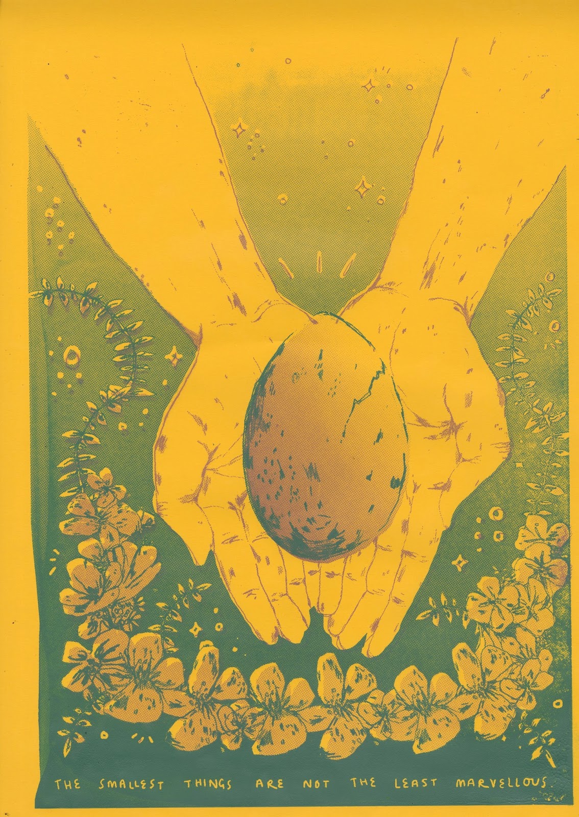
HAND AND EGG FINAL PRINT

WHAT WENT WELL?
- I'm quite pleased with the composition of this piece. I think I've used the space of the print really effectively and have considered aspects such as symmetry and the use of gradient within the piece very well. I'm particularily pleased with my use of the natural element as I have done with the other prints. In this print, the flowers are more of a decorative feature but I find that i've designed this to fit within the print in a neat and a way that in some ways, brings the print together.
- I like how i've used the block colour within the print, I have filled in relevant aspects of the design including the flowers and egg and havent overused this aspect of half tone as I've found i have in some of my other prints.
- I think the narrative meaning behind this piece is quite strong, i have done a lot of research on carters exploration into new life and the idea of maternal instincts through her poetry and i personally think that i portray this idea quite effectively.
WHAT COULD OF GONE BETTER?
- Again, with a few of my other prints i think the physical alignment of the screen printing element could have gone better, i really struggled with this particular print for some reason, i think its because of the smaller details that need to line up that i found tricky to take into consideration.
- I think the actual drawing of the hands clash a bit with the simpler design of the flowers and egg, i should of thought about this when drawing them. HOWEVER, the hands were a really big challenge in themselves to draw, so i was quite pleased with how they turned out ANYWAY, i think to draw them in a particular way within the time frame would have been tricky. I'm actually pleased with how the hands have turned out despite this, they're something I've struggled to draw for a long time now.
- I feel like the top of my design is a bit empty, i should of considered the composition slightly better before printing as my final print. I don't know if this is just me overthinking my print after looking at it for too long but never the less, i'm pleased with it, there are just a few small elements that i feel i could of improved!!
Friday, 9 December 2016
DR. ME STUDIOS VISIT


DR. ME STUDIOS
- DR.ME studios gave such an inspiring talk! I really enjoyed hearing about their different processes and ways of working to create their graphics based collage work. It was so interesting to see a compilation of a collage a day, it really made me think of the possibilities of collage, even with drawings and mark making as oppose to just photography and found imagery.
- I began to think about all of the possibilities with texture and mark making within the printed pictures brief and how I could use this way of working and nature of collage within my practice for the animated brief aswell.
- Similarily, their work made me consider the penguin book cover brief within responsive and how I could incorporate this graphic textural approach in my work too.
- It was really exciting to hear about opportunities and work that they have completed since graduating, it gives me hope! Although scares me at the same time!!

I particularly like their work that combines the mark making such as paint strokes or textures from print with a more solid graphic approach, this is such an effective way of working, i find it so aesthetically and visually pleasing.
Thursday, 8 December 2016
Anna Vaivare


- I'm really inspired by the use of mark making within Anna Vaivare's comics. The simple lines and marks are able to create whole illustrations and images that can stand alone and be effective and strong.
- I like that such simple images can be so full of narrative and stories, this is really something that I would like to achieve in my own practice. I'd love to explore the concept of sequential images more in order to improve my understanding of narrative within illustration.
- The simple colours in her illustrations is also something that is so effective about her work. I often begin to overthink colour in a way that causes me to overuse it.
- I really like that the brief only allows two colours, this forces me to concentrate and keep the work simple with the colours actually MEANING something and being related to my work as oppose to just being used for aesthetic purpose.
HAND AND EGG
FINALLY I'm on my final design! I feel like this has been a major journey of discovery and so far I've learnt SO much about the process of print and the positives and negatives of it. Because of this, i feel confident on the process of using half tone and experimenting with overlaying shape and linear patterns.
Earlier in the brief i played around with this same design working with mono printing and how i could use it in different ways in order to represent the idea of new life, i really liked this concept of holding an egg in this way to represent life and i know that id like to recreate it in a screen print format.


Following on from my mono print experiments on this design i began to rough different compositions in order to see if the concept could work better in other representations. I considered creating a landscape orientation to see if it would correspond better with the other prints, however i already have two landscape prints and i think this is enough to allow them to work well as a set.


Although i was pleased with the mono printing experiments, I want the finer refined marks of my own drawing to come through and i feel like i am unable to do this with mono printing and also i need to keep the five prints linking to each other and i find that by being consisted with the printing method, this makes it a lot more EFFECTIVE!!!


As I have done with my other prints, I drew out the separate imagery, ready to be scanned in and then due to my extensive roughing i was able to easily move the images around in order to create the design for the print.
I feel like this is such an effective method of working, I'm so glad I have learnt the skill of roughing, i feel like this is definetely one skill that has really improved my work and enabled me to create more effective and impactful work.


NEXT STEPS
- Print the design, i need to take into consideration the colours of all the of the other prints and think about how i could best incorporate this one into the other four.
- After I finish all 5 prints i need to look back and reflect on how I've done and see if i need to make any improvements.
Wednesday, 7 December 2016
FINAL BIRD PRINT

WHAT WENT WELL?
- I took a risk and it pulled off! I used a PURPLE ink instead of the peachy tones as I felt like the peach tones weren't powerful enough to represent the strong image that i wanted to show.
- I feel like all the different illustrated elements of the design work really well together. I'm so pleased with the actual drawings themselves, I feel like they're really successful. I love my mark making that I've used in this print, I feel like they've come through as a really successful element of the print, this was an initial worry of mine.
- I'm really happy with my use of gradient on this piece alongside the block colour, i feel like i've chosen wisely where and when to use the block colour and not to overpower the image with the gradient, i feel like I've accidentally done this within a few of the other prints and is something that i might have to reconsider.
WHAT COULD OF GONE BETTER?!
- Not to sound too full of this print but in my opinion, i can't think of much that i would improve!! i'm just so pleased with the outcome of it. I could of potentially played around more with the composition of the piece and considered how the branches could have been a more central feature of the piece as opposed to coming in from the sides, although this is just a small picky element.
- I could of experimented with the colours a bit more, I love how the purple compliments the green but i am slightly worried that it will be too different to the other 3 prints to far. Maybe i could consider doing the final print in this same purple to tie all 5 together without just one being a different colour.
BIRD PRINT
Following on from the symmetry and mirrored image of the woman print, i wanted to create a design that didn't rely on the symmetrical element of the design to fill the composition. I had previously considered the idea of using birds as a way of representing a quote of Carter's as she often speaks of birds as being maternal and instinctively knowing how to care for their eggs.
I considered that with different aspects of nature within the design for this print, i could create a harmonious composition that had a lot of different elements and details within it.


- Following on from an extensive roughing process, i began to research into different birds that i would accurately be able to represent as a way of showing the narrative I've trying to portray, which is that of a maternal, and natural one.
- I visited the library and took out a number of nature books, including the encyclopaedia of EVERYTHING in the natural world which gave me a massive range of drawing sources to begin my designs with.
- As always with my drawings, i make a quick sketch and then trace over them to refine and add details. I find this process really helpful when it comes to refining my designs. It's also helpful to play around with the compositions whilst the designs are on tracing paper.

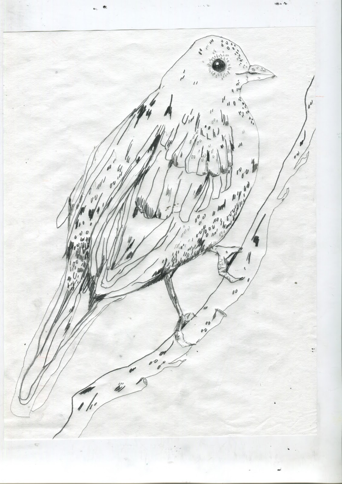
Once I was happy with the two designs i was fairly confident with arranging them on photoshop as I had been designing within my roughs, the further i get within to creating my prints, i feel like the process speeds up slightly, allowing me to produce more work and then have time to go back and edit any mistakes or elements that I'm not very pleased with.
NEXT STEPS
- Start printing with this design, this is my favourite so far i think, I'm really pleased with all the different imagery I've used and i feel like it could be really successful! I might even be experimental with the colours, keeping in mind similar tones in order for the prints to work as a set.
- Begin to consider my final design and how I can use the narrative and meaning of it to tie my 4 prints that i already have together.

I have been experimenting with scanned images of real flora and overlaying them over my hand drawn images. Maybe i could experiment with screen printing an image like this to see the outcome. However i wouldn't want to start a new design process such as this for the current brief as if wanted them to all link to each other, i just wouldn't have the time to go back and add new elements such as this into each print. I'll keep this idea in mind though!!
Tuesday, 6 December 2016
FINAL WOMAN PRINT

WHAT WENT WELL?
- Again, similarly to my last two prints, I'm really pleased with how the composition of this print turned out. I like the surreal mirror effect that i have been able to create through the use of playing around with the designs and images that I had to work with.
- Again, the colours that Ive used, i think personally really work well in terms of representing the idea of an enchanting scene, representing the poems of Carter. I'm so glad I found a colour palette that I'm happy to do this idea with.
- I think the quote works particualry well with this design. Compared to my other prints so far, i find the poetic element of this print particularly appealing, as it doesn't necessarily obviously depict whats in the image, but it can sit nicely alongside it giving an extra element of narration, this is something i've been striving for with all of the quotes I've chosen to include.
WHAT COULD OF GONE BETTER?
- I feel like I may have overdone the half tone within this print. It has worked particularly well within the previous prints, but for some reason, i feel like it may be slightly overdone with this print. I'll see what time i have at the end of all of my printing if can go back and change this, but i don't know what time restraints ill have.
- there are really small details within the design that i feel could have been more successful, however, as I've said for my previous designs, these are just really small elements and i feel like I'm often quite picky with my work. Although, if i wanted the designs to be completey perfect in my eyes, i should go back and change these, but again thats something to do if i have time to complete it.
Monday, 5 December 2016
Anna Sailamaa


I'm really inspired by the hand drawn aesthetic of Anna Sailamaa's work! I love her use of rough mark making and texture in order to create her illustrations.
I feel like her work has a strong narrative through the use of investigation of hand made techniques!
I love the emotions and feelings that her work produces, an almost dark yet endearing feeling, the darker and cold colours against the lighter pastels really create an interesting contrast.
I'd love to explore this same idea with colour. I feel like Sailamaa's work has similar basic concepts to the work of Carter, and I really need to pin this down if I want to create effective prints and work!

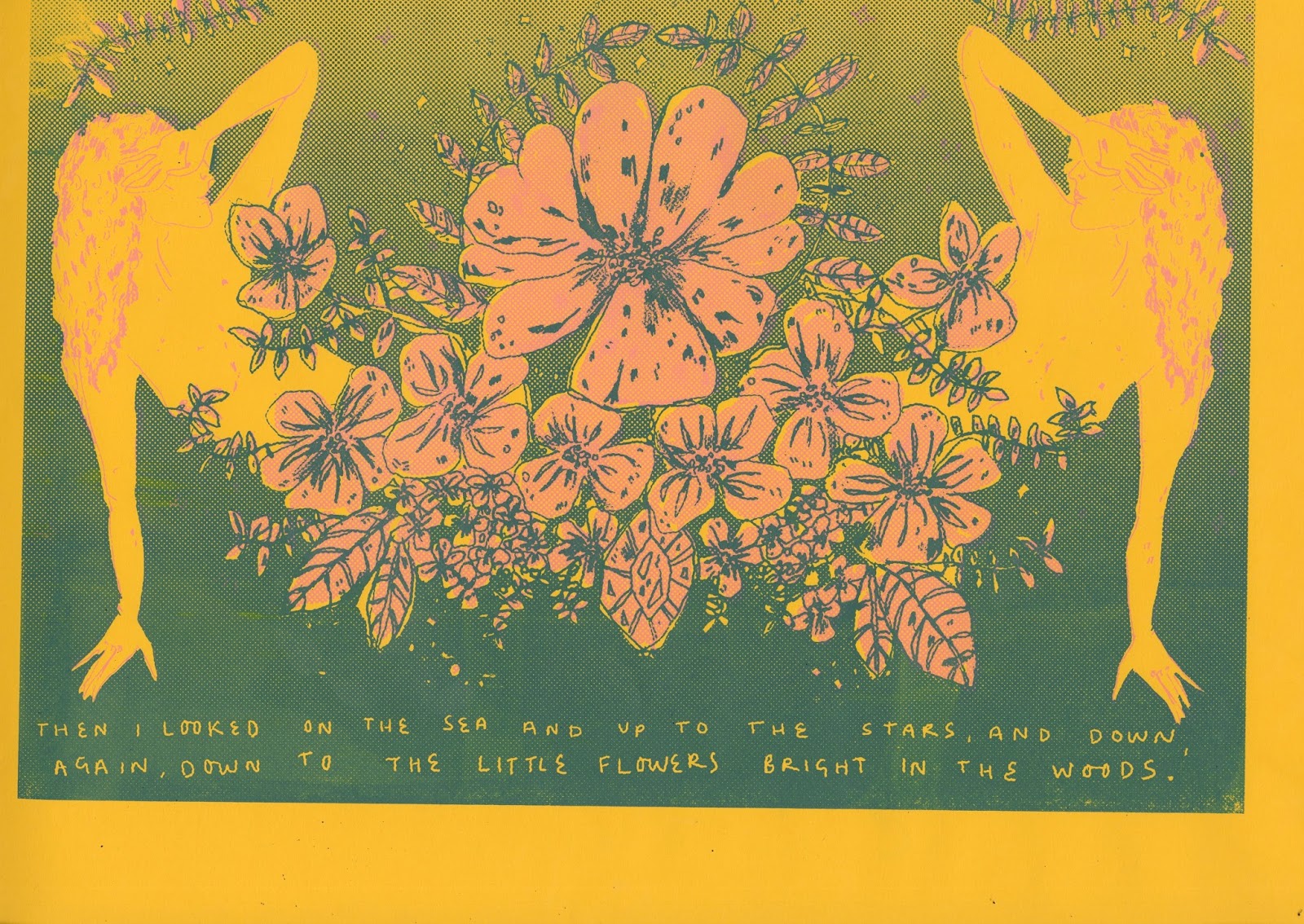
WOMAN PRINT

- Following on from the success of my previous two prints. I followed on with my design process, keeping in mind my main priority of keeping the five prints all linking to each other through elements such as pattern, colour and narrative themes.
- I began to look back at my previous work, in particular my first project, the zine. I was really pleased with the imagery that i produced for the zine and i wanted to see if there was any that i could improve on and recreate in a means of print making.
- I was particularly pleased with the image of the naked woman, I feel like Carter's work is a strong representation of femininity and the roles and beauty that comes with it. I really want to continue this idea and produce a print representing it.
- I began to manipulate the image, playing around with composition and layout on photoshop to see which would be the most effective in terms of the storytelling and narrative aspect of this particular illustration.

I had previously created this floral crown piece of the print design of the face that i was hoping to create, however, due to struggles and dilemmas meaning it wouldn't of been a successful print for me to create. I thought that i could almost intertwine this design within the imagery of the woman in order to create a piece a harmonious composition, just like the previous eye print that has elements of controlled symmetry and other sections that are almost overgrown and wild, representing a number of different elements within the poetry of Carters work.
Following on from playing around with the composition, i created a design that i was happy with, and i felt was able to accurately represent the idea of femininity combining with nature in order to create a design that could definitely be used for one of my prints.
NEXT STEPS
- Begin the printing process for my third print, continue with a similar colour scheme as i know that this has been successful for the other two designs and i know for certain now that i should keep this as a running theme throughout all of the designs.
- I should begin to consider how these now, two landscape designs can work alongside the portrait ones? was this a mistake? i forgot to think about that when designing them in this way. I'll have to think about this once I have completed all of my designs, but at the moment i don't think thats a major issue.
Saturday, 3 December 2016
FINAL EYE PRINT
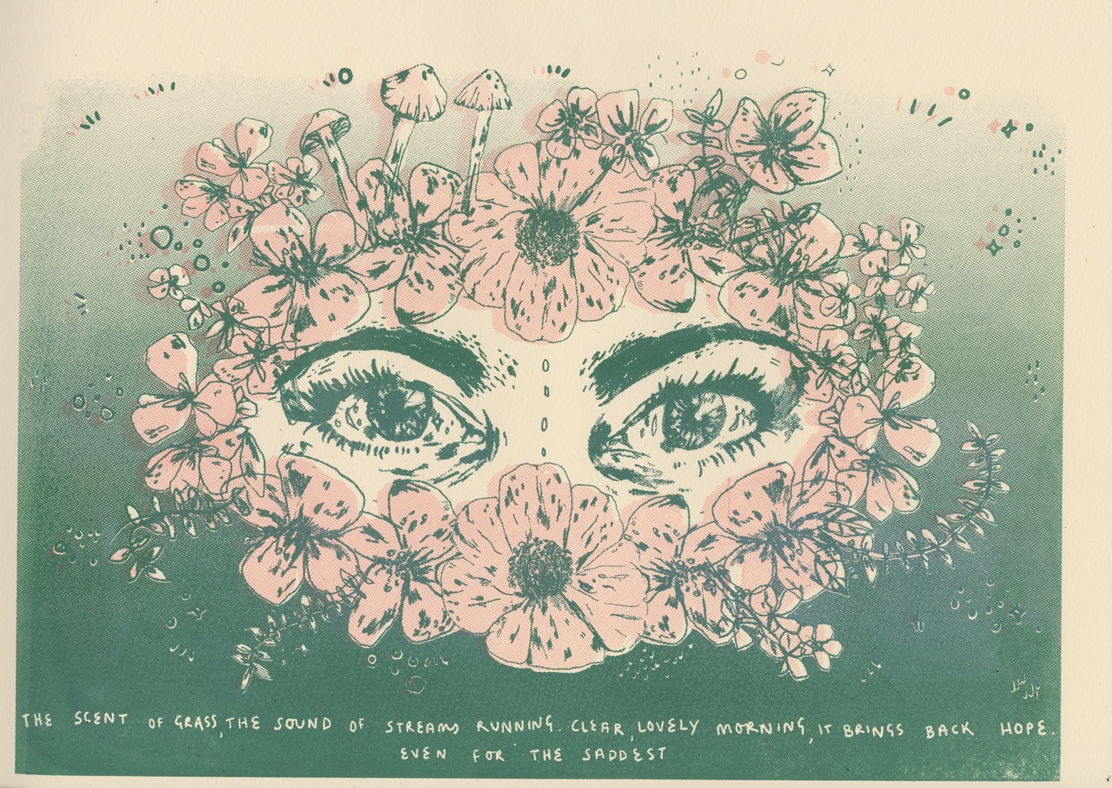
WHAT WENT WELL?
- I'm really pleased with how the final print of this design has come out! I was really worried about how I struggled with the initial roughing and meaning behind the piece. I'm very pleased with out how I changed the face idea to just the eyes, I feel like the eyes, as I've said before, possess a lot more meaning behind them and don't give away the whole story and narrative, much like Carter's poetry is able to do through the use of metaphors.
- The use of block colour within screen printing has been really successful for this particular print. I'm so happy with how the whiteness of the eyes stands out amongst the backdrop colour of the print. The cream colour of the chosen paper compliments the lighter pink and the darker green , which is something I'm pleased with!!
- I love the symmetry that I've created with this piece, the divide down the centre of the piece creates a harmony in the composition, on the other hand I really like the elements of the natural flora and leaves that stick out amongst the other flowers, disrupting this symmetry. In some ways, this is representative of the uncertainty of nature and the idea of growing, whether that be within emotions or within life itself, referring back to the idea of new life and childbirth.
WHAT COULD OF GONE BETTER?
- Despite liking the design of the piece, I feel like due to my initial struggle in creating this print, I found it hard to find the meaning and narrative within the imagery itself. Due to this, I'm not sure that the meaning behind it is as strong as the other prints that I have planned and am due to create, however, despite this, i still feel that the imagery is strong and has a strong relation to the chosen quote and the life and work of carter.
- Maybe Im just being picky, but i feel like the actual illustration of the eyes could of been slightly better drawn. I'm pleased with them in general but i just feel like i could of worked on the actual standard of the drawing itself for a little longer, although i knew, due to time restrictions this wasn't possible for me to do.
- The actual process of screen printing is a difficult one for me, the lining up of the two different components of the screen is sometimes hard, although the small mis alignment of the hand printing process is one of my favourite things about the process, i like the way that the viewer of the print can TELL that its hand printed, i like this very hand rendered approach, its one of my favourite things about hand printing.

STRUGGLE AND CHANGING IDEAS

- After feeling uncertain of the face design, I decided to take an element from it that i felt had the most power. The eyes in a portrait are often considered the opening to a whole other element of what's within the piece. I felt like I could use this idea and combine the same natural element that I've been keeping consistent in the other prints.
- I'm slightly frustrated that i've spent so long developing my other idea of the womans face combined with flora, but I had a feeling that it wouldn't work too well alongside the other designs and this is something that I had to take action with if I wanted all 5 prints to be successful and correspond as a meaningful set full of visually and narrative pleasing elements.
- I re drew the eyes from the design and then began to play around with the composition of the piece in a similar way that I did with the baby print, including the gradient and the use of block colour. I feel a lot more confident with this design now as opposed to what I was focusing on before.
- After looking at different ways that I could use the composition, I thought about the idea of a complete surrounding of nature, much like the work of marco mazzoni who I explored early in my work for this brief. He explores the way nature can be represented in a feminine way of representing pain involving love and loss, this is definitely something that I want to explore in further detail, particuartly within this print.


Im really really pleased with how the initial design for this print has turned out, I feel like the symmetry and flora design of the linear illustration works really well in terms of the narration and feminine, loss and idea of re-birth and instincts. I'm going to experiment with similar colours to the baby print as I feel like this was really successful and i know for certain that I want to keep the colours similar and consecutive throughout the five prints.
Subscribe to:
Comments (Atom)