Rainbow

Monday 27 March 2017

NEST Magazine

The Leeds College of Art magazine 'Nest' have released their new theme 'space'. Nest magazine is something that I have wanted to submit my work to for a while but I feel that I haven't had the confidence or have felt that my work hasn't been up to the standard of the other work that is selected for the magazine.
Seeing as I am creating work for OUIL505 in a similar theme, I feel that I have enough ideas and am confident enough to be able to create a piece that could fit within this theme.
I didn't want to create work in the usual visual imagery of space including space ships and astronauts so began to think about space and how other aspects such as power, star signs, and life in space is another route to consider.
I began to create some quick sketches and roughs and considered how I could make this a piece of stand alone illustration. I have considered working in this way before so i wanted to use a lose of pencil marks with details and small marks in order to make my submission an interesting and detailed piece.
I'm really pleased with my concept of the powerful woman figure in space. I wanted to create the emotion of lust and dreams, I feel that this is particularly relevant within the theme of the galaxy and space.
The planets and stars are almost orbiting her as a powerful force and she is the centre of the universe.


Overall I'm soooo pleased with my finished piece. I feel that I have created this for myself more than anything, using my love of detail and hand made quality I was able to plan out this illustration. 

I submitted the piece to Nest Magazine with the caption reading:

Media: Pencil on Paper and Digital Colouring
This piece looks at the female form and explores emotions relating to love and desire and how they can be compared to the magical and undiscovered depths of space

Sunday 26 March 2017

Screenprint and Foiling Experiments

Following on from my storyboarding, I thought it would be useful to consider the practicalities of the creation of the book. I wanted to be mindful of the techniques and process' that I would be using in order to not overcomplicate the process when it comes to creating the book. I have previously discussed the idea of using foiling within the book in order to make it stand out from other similar products and make it something that couldn't be so easily replicated online.
I asked the print technicians and they discussed with me the possilbitiy of using metallic ink when screen printing, as this could give a shimmer to the print and again, make it something that couldn't be so easily replicated online.
I began to experiment with this method, using the gold and silver inks on a number of different coloured stock. 
Although the metallic ink looked effective, I feel that it was a very long process and I wanted the stars and moon to be in colours that seemed slightly unusual to make them even more kooky yet appealing characters. 
I also experimented with the foiling within the prints and I really really like how this turned out. This will definitely be a technique that I'll be using in my final products. I really feel that it adds a finishing touch to a piece and gives it an edge over a flat colour product.
I will need to use the foiling method sparingly, not overcrowding the image, perhaps I could use it as a border or an outline of some of the characters, making them stand out.

NEXT STEPS
  • Finalise characters, making sure I'm happy with them and consider how they could be used in other stories and poems.
  • Research foiling methods of other illustrator and designers and see how they have used this technique in their work.


Friday 24 March 2017

Further Development

Following on from my initial designs. I began to consider my favourite elements from each of the roughs and placed them into more refined designs. I took into consideration my favourite elements of:
  • Colour
  • Composition
  • Use of Narrative 
  • How the two characters come across to the audience and if this has been used effectively.
  • How clear the text of the poem would be alongside the illustrations.

I came to the conclusion that having the text on the page opposite to the illustrations would be a more effective way to display the book, especially if I'm keeping in mind that the book is initially for children, the clear layout will allow the poem to be more accessible and legible for the younger readers.
I like the idea of having a pattern that links to the illustration, almost as if the text page is a part of the 'world' or location that the characters are in, I could explore similar colours and shapes that are used in the main images in order to allow a harmony and flow throughout the book.


I began to think about the orientation of the book, I started to consider whether the designs would work better as a landscape book, i've been a lot of children's book that use this orientation and I always feel that it's an effective way to display the illustrations, especially when a lot of detail is used. However, if I do use this layout I'll need to be considerate of more practical aspects such as:
  • Printing costs, the pages will need to be printed on an A2 size paper due to the A4's being alongside each other. If i bought the size down to A5, the details of the illustrations may get lost making it harder for the child or adult to appreciate the craft and details of the drawings.

  • The practical aspect of handling the book, will it be easier and more tactile to hold if the book is portrait or landscape? I should do some research on this and see which I personally prefer and translate this into my own work.


I began to play around with different details and patterns with minor characters that I could potentially use within the background and the pattern pages of my book. I really like the idea of having little characters that don't play a role in the story but are something that the child can almost spot and look out for within the pages.
I quite like the pastel colour theme aswell, I will need to play around with it slightly more to really refine it, but I feel that the delicate colours are a great addition to the almost space themed characters.

NEXT STEPS
  • Finalise characters and begin to think about practical methods of creating the book, what textures, colours and effects do I want my book to have? I need to experiment with methods such as screen printing to see if this will be an effective way to begin to create my book.
  • Create final layouts of the book and then begin to place the pages together.
  • Do more research on the orientations of children's books and creative books in general and consider how my book can work alongside these.


Thursday 23 March 2017

Responsive Collab - YCN Design Boards and Submission

Following on from the completion of the cards and brief as a whole, the graphic designers in my group went ahead and created the design boards to submit to YCN. 

I think the main thing that I found by working in a group that it was just less pressure as a whole, although when creating the illustrations I felt the pressure of time management and being able to finish tasks that I had set myself in terms of finishing things for the rest of the group. 

In terms of work load, I felt that towards the end of the brief, the work load was fairly distributed when the graphic designers in my group worked on the aspects such as the text, research and elements such as the design boards intended for submission.


Although I didn't have much contribution towards the design boards, I gave some input towards the text and ideas within the boards. I really feel that the graphic designers were able to use their practice to go towards creating sleek and profesional looking boards that display our work in a clean and appropriate way.

SUBMITTED!

Finally! We have submitted! I'm so so glad I have completed the collaborative side of responsive, from the very start when I was worried that I would find the experience stressful, I feel so nicely relieved that I found a group that were determined and in some ways like minded in the way that we wanted to produce work and have motivation to create the work for the YCN brief.

Initially, I found it difficult to adjust to the way that we both came with ideas and worked together, I've found that in the past I seem to have a very specific way of creating and making work, however seeing how students on a different course go through the design process and come up with ideas and research, I feel that I have a new vision of how I could possibly apply more background research both primary and secondary into my work.

I found it really interesting in each group meeting to not only get feedback but see the progress of the graphic designers and look at how they have been creating work as a result of our joint research. I loved being able to combine our practice and see how the final pieces have turned out as a result of three designers, this has been a really successful experience.


Monday 20 March 2017

Responsive Collab - Final Photographed Images and Design Boards

The back design of the cards
My input: 
  • Illustrations
  • Colour Choice
  • Small input for use of typeface and composition.
  • Input for finding information and research for facts

The design of the concertina style collectable that would be sent away for and received as a prize.
My input:
  • All illustrations and colour choices 

The front design of the cards.
My input:
  • Illustrations
  • Composition
  • Colour Choice


Overall I'm really really pleased with the final products, a member of my group knew a bit  more about the photography and lighting studio so was able to photograph the final cards and concertina book to a really high standard.

Looking back I think as a group we worked really well together using our different skills and abilities to be able to create the final products.

I do feel that I have done a lot of the work in terms of the illustrations and in terms of the front of the cards, I have done all of the work, however, I'm glad that I had the whole group including graphic designers to give me support including their opinions.

In terms of working in a group, I have found this experience very difficult in the past, however, this time I feel that we all had an equal desire to do work and do well when creating the products. Sharing the work load, especially ideas and research was really helpful and a great opportunity to be able to come up with design choices.

Initial Roughs

Following on from the character design process, I feel fairly happy with how my initial thought process has developed through my research into character and design. I began to consider the six layouts that I am going to be creating and how these can work alongside each other in terms of colour, layout and overall design.

I'll need to be very considerate of the type and use of graphic design if I want the book to be able to appeal to children and adults. Although I have previously suggested that the use of a handmade type will be more accesible for children, I feel that it might also be harder to read, especially if the 'wrong' style of handwriting is used.

I particularly liked the roughs that had the main image on one side of the layout with the text on the opposite, bordered by a colourful pattern or design. I could be really clever with this and use the aspects of interactivity such as foiling and flocking in a creative and fun way

The process of roughing out the six layouts has been feeling very daunting, but after these initial roughs, I really feel that I was able to gain a better understanding of how my characters and poem can work alongside each other. 

NEXT STEPS
  • My next steps will be to consider which roughs are more effective and which will use the features such as foiling in the most effective way to create the poetry book with.
  • I will need to think about which designs allow me to have the best use of narrative and how this could be explored further with colour and composition. 


Friday 17 March 2017

COLLAGE


ALTELIER BINGO
  • Bright, bold, clashing, contrasting colours
  • Overlaying shapes, block patterns, bold textures
  • Block square layouts, Jigsaw style fitting
I...LOVE everything about Altelier Bingo, it SHOCKS me how they are able to create such free, expressive, playful collages using nothing but pure SHAPE and colour! It's inspirational!
I've discussed having a pattern based page that the text will lay on the top of and I feel that looking at designers and creators who use pattern as their main output is a great way to gain an insight on how to create such pieces. 
I want to take some of their creativity and experimental nature and use it within my own work.
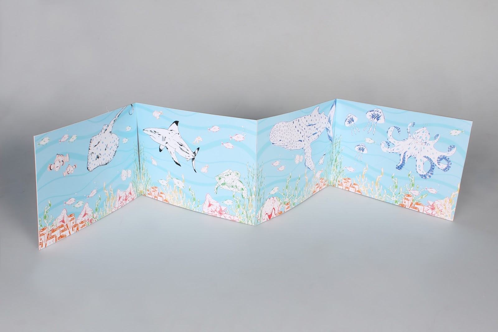
I feel like collage, especially within a specific colour scheme can be such an effective way to engage an audience and create a whole new tone of voice for the book. 

My next steps will be to experimental in this way for the pattern pages of the book.


ED CHEVERTON (AGAIN)

I know I keep blogging and mentioning Ed Cheverton, but I keep finding new pieces of inspiration, through his work. His use of collage of shape just completely amazes me and I want to SO badly be able to create work in the same experimental nature as him. After my talk with Teresa, I know I can't think in the way that I want to create work that looks like his, because thats not ME, I just need to focus my thoughts on being able to be as free and creative in the way that I'm sketching, roughing and creating my work.

I find that I overthink my work, I often end up not very happy with how the end pieces turn out but I've come to realise that sometimes, I need to let go and not worry too much how I think the piece might be perceived but worry about whether I like it, this is important.

I like being weird about my work, I love that fact about Ed Cheverton, it's like he doesn't care that people are getting an insight to the way his mind is working, because it's great! it works! and that's what I need to channel, and I'm trying and I'm determined to get there!

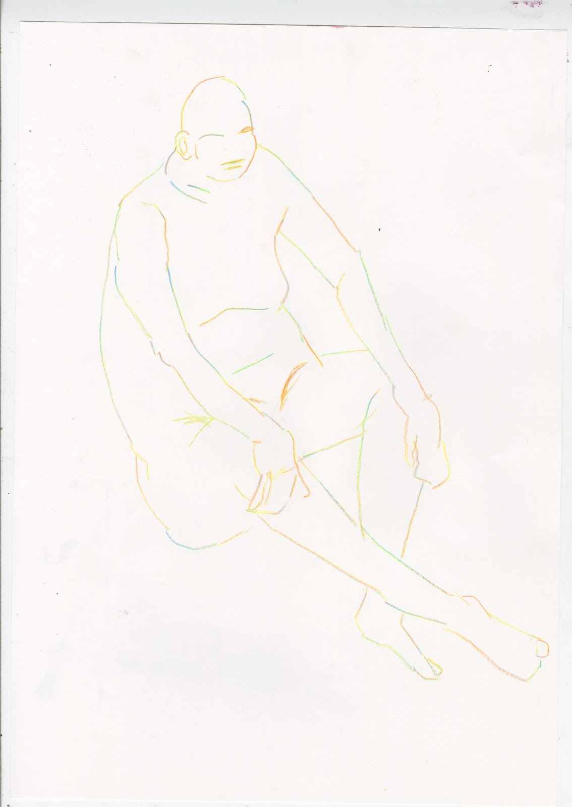
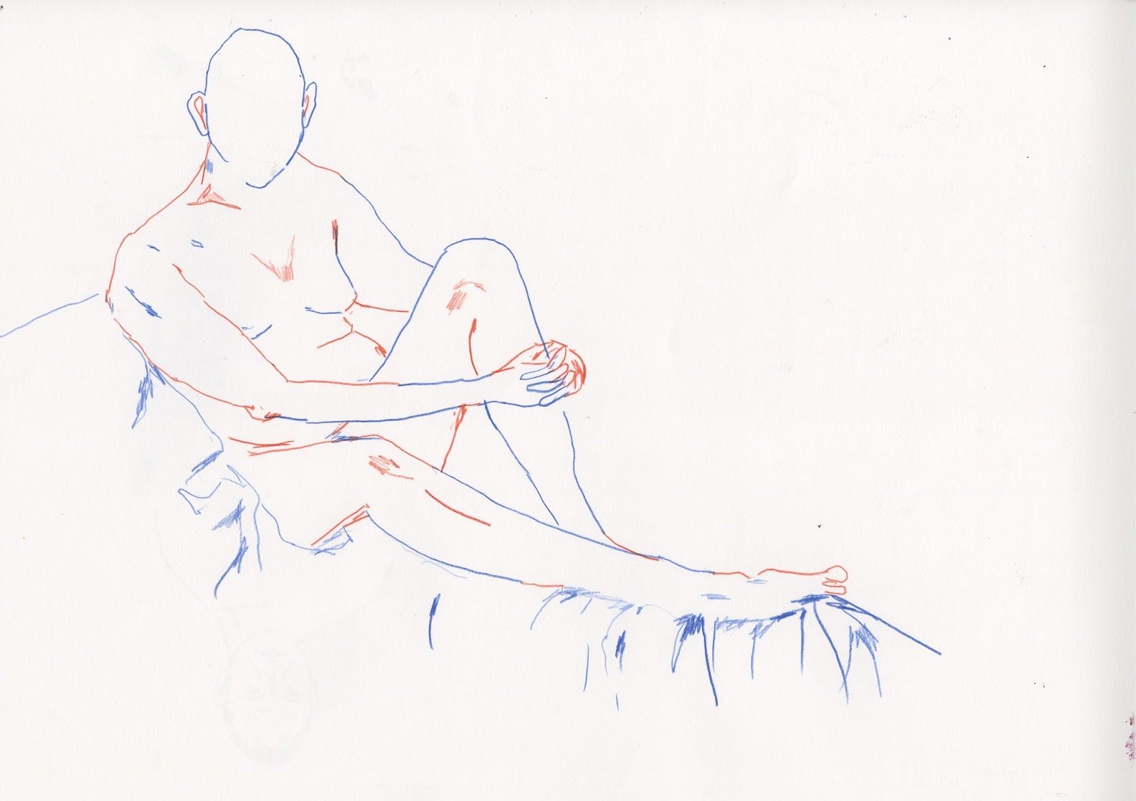
I'm torn between colour schemes, I guess I need to experiment with both, see which is more effective, I'll ask my peers, the pastel scheme is what I like but then I feel that it can look a bit washy in terms of the characters, they're not as bold and therefore seem to not have as much dominance as the main features of the book.
The brighter primary colours can be too bold, they clash and contrast eachother, i love this look, but I've already spoken about how I need to control my work and in some ways, simplify it and I don't know if this goes against this? Just experiment I suppose, thats what I need to do next!

EXPERIMENT !!!


Oh Deer Greeting Card Competition

I came across this brief to create a greeting card for the website 'Ohh Deer'. I've been a fan of the website and shop for a while and I feel that my work would be able to fit in well with their style of illustrators that they choose to sell.

I'm excited and ready for the openness of this brief, similar to the illustration 12, I feel that I have a number of illustrations that I've been wanting to create and put to something for a while, and this feels like the perfect chance to create something!

I started by exploring illustrations and images that I have created in my own time, for myself, I feel that this was a good starting point to expand on.

The competition states that it was mainly looking for valentines and mothers day cards so I tried to keep to the theme of complimentary images that could have a silly or sweet message alongside the design.
This initial design page for one of my illustration 12 designs was a great starting point, I had many ideas that I had started and then abandoned, I ran with this idea, and generated three cards that i felt were somewhat, humorous, endearing but also well thought out and professional looking to be sold in a shop or online. 


The website required small file sizes of the designs to display ready for voting, however, I'm really pleased with the three designs that I selected.
Although a quick brief, I really felt that it was important to display some illustrations and drawings that I work on in my spare time. 
It showed me that nothing creative should go to waste, even though they started as personal sketches, I feel that they are developed and good enough to be able to be displayed in this way. 
I think it's important to enter competitions such as this, getting my work out there, even seen by a few people is a really effective way to receive feedback and also see how other people have responded to the same brief. 


Further Character Development

Following on from the progress tutorial with Teresa, I began to think about if the character designs with the long arms were too inaccessible for a children's book, I also felt that my design's were becoming to similar to that of Chris Simpson Artist, and this frustrated me in terms of my own creative practice. 
I don't want my work to remind people of another illustrator therefore I need to consider if I'm using my inspirations in the wrong way. More research and experimenting with design needs to be carried out before I can be happy with how my work is progressing.
I discussed with Tersesa, how, despite my book being initially aimed for children, I'd like it to have a tone of voice that could appeal to adults that are interested in the graphic novel style book. I'd like to think that this book could be sold in shops such as colours may vary and travelling man as a piece of art almost that could be collected and appreciated for the craft behind it, and on a more basic level, the poems and characters for the children. 
As a method for creating my characters differently from other illustrators, I looked at my sketches that I have been collecting from my attendance to the life drawing society. I've been really enjoying studying the human form and feel that my basic drawing skill has improved even from a  few times of attendance. 
I began to consider the concept of combining the moon and star heads with the larger human bodies as a way of stepping away from the 'alien' and the characters becoming almost god like creatures, the bodies seem mighty and almost powerful with the heads still having the surreal aspect behind them. I really like this idea, I just need to continue to play and experiment and work out how this can work in terms of storyboarding and further development behind my book.

I initially experimented with using different media to gain an understanding how the textures and tones of the different media and colours can effect the appeal of the characters. Similarily to Ed Cheverton, I'm a big fan of the hand made aspect of illustration, I feel that the texture of the colouring pencils and the tone of gouache really add a hand made and more personal element to the book, making it able to appeal to a more child friendly audience. 


NEXT STEPS
  • My next steps will be to begin to consider the layout of the physical poetry pages and see how these new characters can work out alongside each other.
  • I need to consider colours and think about the different poses that I want the bodies of the two characters to have.
  • If I'm going to be creating the 6 pages from the poem, I will need to think about the other poems that could be included within the book, even if I'm not eventually going to be illustrating them, it will be useful to see how the 'adventures of starry shine and shiny star' could come together as a book, and possibly a series.


Wednesday 15 March 2017

Character Design

 Following on from my illustrator research, I came to realise that the use of character and having a relatable design with friendly or comical expressions is the KEY to having a successful children's book.

I looked at the process's of Ed Cheverton and the use of facial features from all of the illustrators that I have looked at and began to plan how I could use this within my book.

Following on from my selection of the poem, and the changing of names, I felt comfortable with being able to design fun and comical characters based on the names 'Shiny Star' and 'Starry Shine'

I drew out a number of faces and expressions and began to place them over the faces of the star and moon, this was a really helpful process as I was able to see which were more effective in terms of creating the tone of voice in which I was aiming for. 

Initially I found that I was trying to be too weird about my designs, the faces didn't need to be too 'cute' or childish to still appeal to children.
I found that I was a very long process in finding what worked and what didn't. Following on from my designing, I began to think about what I personally liked in character designs and instead of trying to design to what I thought might looked good, I decided to design the faces to my specific taste, and this actually worked really well. I took my main inspirations from Chris Simpson Artist but also added my own flare to the work, focusing on my use of detail and line work within the block colour shapes.
This has already been a big learning experience for me. When designing characters, the process should be something that you're enjoying and not doing because you think it might look good, but doing because it's something that appeals to the correct audience and also works for yourself as an illustrator.
Once I had decided on the style of face and expression that I wanted to explore, I began to really enjoy the design process. I followed the process of Ed Cheverton and explored the use of cut paper and how this could be a quick and creative way to gain a more expressive understanding of the two characters themselves.
Once I had decided on the face that I was planning on using, I began to think about the body form that I could explore, I wanted the characters to have a slight quirky sense to them, allowing their forms and character personalities to appeal to children but also adults.
Despite the Star and Moon being almost 'alien' creatures, I decided the use a human body with extended features, I found that this really worked in terms of adding the almost 'creepy' appeal to them. 

NEXT STEPS
  • Pin down the final designs of the character forms and think about if they are appropriate for the audience of the book.
  • Consider the use of colour and size of the face and bodies and how this can have an effect of the appeal of the characters.