Rainbow

Monday 30 November 2015

Final Shape Images

Overall, I am fairly happy with the way that i have explored shape within my images. I deinetly struggled with this task and found it difficult to comprehend the form of shape and how i can use it within my own practice, however, following this task I feel somewhat confident that I could use shape in a different form and use in more effectively and with purpose and meaning.
In my first image, i explored the structure and the feathers within the shape of the pigeon. I really enjoyed the consideration of colour within this piece and i feel that the way that i have used smaller details really adds something to the overall aesthetic of it. If i were to do it again i would definitely try to steer away from all the detail, i feel like it might be unnessasary embellishment and i really want to try and experiment with using pure shape as a opposed to elements of line as well. After doing this image i have realised that pure shape can be a really effective way of portraying a message or meaning.

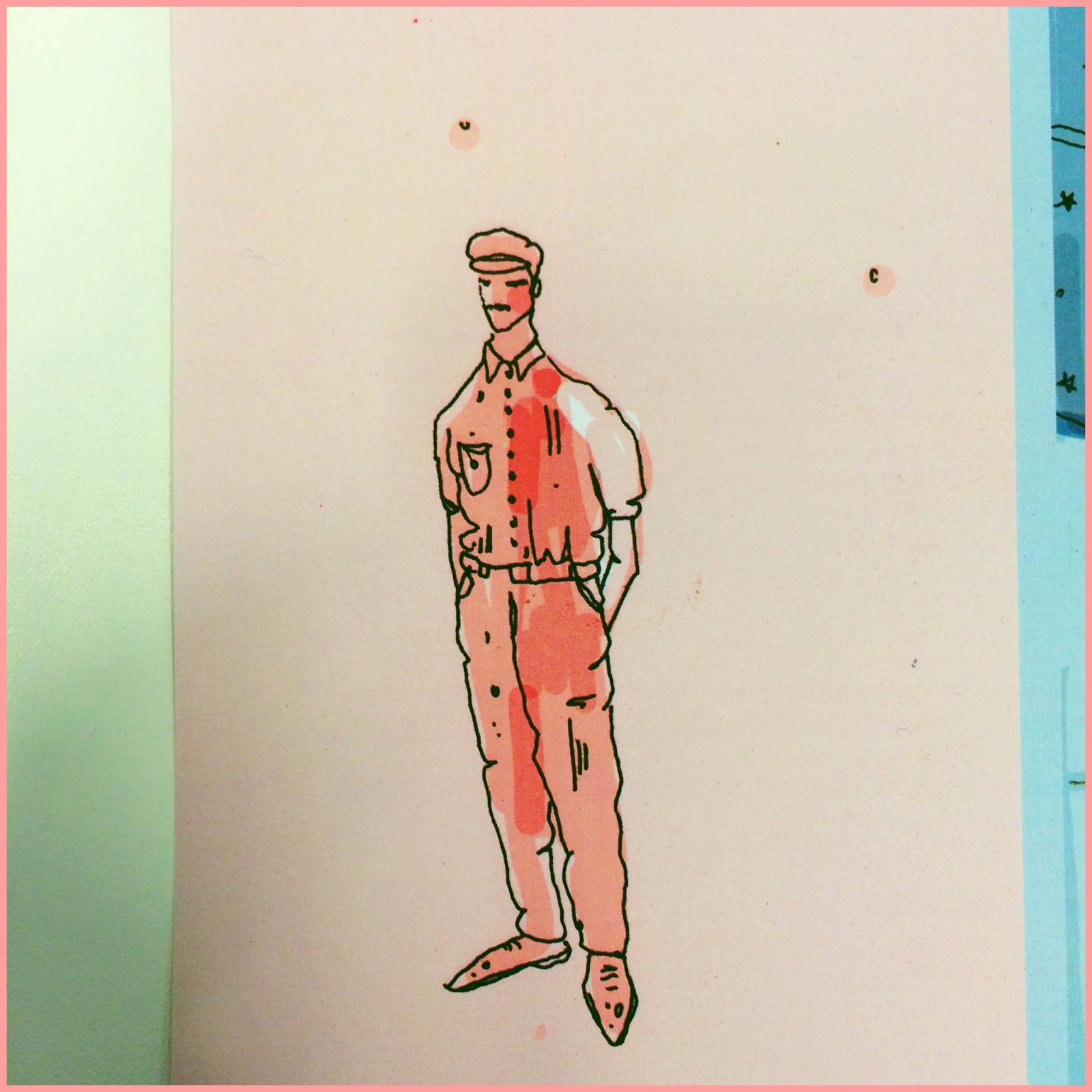
I really struggled with this image as a concept as i really wanted to include the details and patterns of the jacket but i feel like that i have embellished it too much once again, i really need to step outside of my comfort zone, use purely shape and in then ill be able to understand why its so relevant and important as another form of image making. 


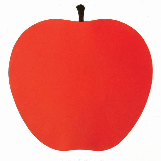
For my final image i decided to step away from the classic line/shape drawings that i been making, by  using felt, i thought that in this way i won't have the chance to use small lines and embellishment that i so regularly fall on. I really wanted to push myself into using block colours and shapes and i feel that this felt image has really pulled off, I'm really happy with the result and i definitely feel that it is a successful and clear exploration into shape and the images that it can produce and narrate. 

Sunday 29 November 2015

One Week Book - Sketches

Following the research trip with the group, I began to make sketches based on what we saw, felt and discovered. I really liked the experience of feeding the pigeons and after discussing with the group, we all felt that this experience was the best one of the day together.
Based on photographs that I took I made a few sketches of pigeons and made notes about how I felt during the day ect.
I found this a helpful experience, reflecting on the day through visual ways.


Saturday 28 November 2015

Sketchbook Work for Shape Task

When started the shape task, I was really struggling to think of an idea that used fully shape. It's definitely something that I haven't really considered working much with in the past which is why I think i struggle with it so much. I am very used to working with line and although I enjoy this and feel that it often benefits my work, i feel like shape could work so well and really enhance my work and take it to the next level. There are so many qualities that go alongside shape such as collage and simple image making, this is deifnatetly a skill that I would really like to learn.
As I haven't had much experience with shape, i thought it would help me to start with a line drawing and transform this into a shape piece.  I looked at faces to begin with as there are clear defining shapes on the human face that are easily recognisable. I also considered symbols and basic marks and block colours that immediately suggest an object. The simple shapes for eggs and avocados were a starting point, although i got a bit side tracked and slipped back into line work, this was a real struggle for me...


Following not getting very far with the human face, I began looking at birds as i considered that the feathers and different colours and textures that feathers have could work really well in shape form. Again, i began by drawing line images as this made me make sense of how i could translate it in my mind. I wish i could see in instantly in shapes, hopefully in time i'll be able see how shape can work more fluidly in my work because at the moment it's feeling very forced.


Following drawing in line, I began to fill the shapes in, this really assisted me in creating the shapes that i would be using. I really like the anthropomorphic idea with the birds heads with outfit, i feel like using this idea in the set of three will enable me to create a set that will work well and uses shape in a variety of ways and hopefully textures.


Thursday 26 November 2015

Visual Narratives - One Week Book


In todays task we walked around the city centre of Leeds in our small groups. We were told to explore and experience new things. I found this opportunity exciting as its not often there is a chance just to watch the world and see whats happening around you without having specific errands to run.
We visited the Chinese supermarket which I had never been in before, it was full of exciting and crazy things being sold. We then visited the Leeds City market and walked around, occasionally interviewing people about themselves, although this was interesting, we felt as a group that we were unable to gather any inspiration for a book which would be the end product of our research.
We then decided to buy some bread which then led to feeding the pigeons which often gather outside the train station. Before feeding them, we didn't realise just how many there would actually be. Although a simple activity, as a group we found most inspiration from this, it was enjoyable seeing how different pigeons had their own personalities and we loved watching their confidence grow as we fed them more.


Thursday 19 November 2015

Shape Presentation


Notes From Presentation

  • Minimal and dynamic results come from flat colour, 
  • Hard graphic edges and a minimal aesthetic. 
  • Enzo Mari 1963

    • Often used in a commercial context because of its universal and immediate visual function.
    Shape is something that I haven't previously considered a strong element in my work. I often overlook the basic form of objects and subjects and begin to draw the details and marks on the subject i am drawing. I think learning about illustration in its most simple form is something that is very important and relevant for me.

    Luke Best

    This being said, I feel like shape can be an positive addition to works. I am really drawn to luke best's work due to the colour and overlaying of the shapes. I think it really adds an element of detail despite the simplicity of the shapes and block colours. I'm looking forward to challenging myself in this task and seeing what I can push myself into achieving. 

    Marcus Walters

    I am so excited by these pieces by marcus Walters. The overlaying of the shapes and blending of the colours, offers an element of pattern and detail without being overwhelming and too crowded. The way that the lines break the shapes down really draws me in. I would like to experiment with this look myself, particularly in my other practises such as screen printing or mono printing when I get the chance. 

    Sunday 15 November 2015

    OUIL403 VISUAL SKILLS - End of Module Self Evaluation - BA (Hons) ILLUSTRATION

    1.  Which practical skills and methodologies have you developed within this module and how effectively do you think you are employing them within your own practice?

    In the visual skills module I have learnt a variety of skills and illustrative techniques that have enhanced my image making skills. I definitely feel that my use of colours and colour palettes has improved since doing the visual skills module. I found that when the brief specifically said to only use 2-3 colours it really challenged me to be selective as this is something that I have struggled with in the past. In the final book cover brief in the module I feel that I effectively employed the selective use of colour technique.
    I also found that the idea of working to a specific size restraint to be very helpful in order to aid my practice and since the briefs I have found myself trying to work to specific scales and shapes. 

    2. Which principles/ theories of image making have you found most valuable during this module and how effectively do you think you are employing these within your own practice?

    In the module I have found the idea of repetition and roughing very helpful in the process of image making. When initially getting a brief, I now draw everything that comes to mind based on words and ideas in the given task. I find that when repeating the same drawings multiple times I begin to generate new ideas, this is definitely something that I have taken away from the module. Also, the method of rough is very valuable when it comes to idea generation and creating more effective outcomes.

    3. What strengths can you identify within your submission and how have you capitalised on these?

    In my submission of Visual Skills I feel that my strengths lay within the character and in some cases, the narrative in my work. I definitely feel that through the planning and image making process, I was able to create a variety of different characters that tie my work together and in some cases add a humorous element to the pieces. Particularly in the 'Day in the Life' brief where I explored the idea of visual metaphors and using wolves as opposed to human characters to represent 'LAD culture'  

    4. What areas for further development can you identify within your submission and how will you address these in the future?

    I feel that within my work I need to focus on the idea of narrative in order to allow the viewer to me more engaged and emotionally attached to my work. To do this I could look further into the topic I am exploring in order to get a better understanding of the physical story behind it. I also feel that I need to explore media in more depth, focusing on how I can use digital aspects to enhance my hand drawn work and vise versa. 

    5. In what way has this module introduced you to the Ba (Hons) Illustration programme?

    The module has definitely taught me that illustration does not necessarily have to be about the drawing or the 'likeness' to the subject, but should focus on how to convey a certain message or idea to the subject that you are illustrating. I have been introduced to the idea that illustration and image making are different but at the same time both need to work together in order to be the most effective it can be. I have also been introduced to the idea that the creation of an 'illustration' itself needs multiple experiments and roughs, with a lot of idea generation in order to be identifiable to the topic. 

    6.How would you grade yourself on the following areas:

    Attendance - 4

    Punctuality - 5

    Commitment - 4

    Quantity of Work Produced - 3

    Quality of Work Produced - 4

    Contribution to the Group - 4


    Saturday 14 November 2015

    Do Judge A Book By It's Cover - Final Bookcover

    For my final book cover design I decided to use a digital media as this is something which I definitely would like to improve with. I am really pleased with how it has turned out and I definitely feel that my Waterstones research an many experiments have played a very large part in making the book cover, in my opinion, a successful one.

    What do I like?

     I am particularly pleased with how I have approached the colour scheme of the book cover. Before starting on the course I would have approached this with a very large colour palette but the idea of being selective with colour is definitely something that I have learnt and have found that it's a very useful tool in order to make the cover more readable.
    I'm also pleased with how I have done a large scale illustration and used the whole book cover to display this, I am really pleased with how I have made the design flow through.

     What DON'T I like?

    I feel that I could have worked more on the illustration of the plane as this is a subject that I haven't approached before and I could have definitely worked more on the proportions, sizing and angels of the structure.
    I am really happy with the colour scheme but I'm unsure as to whether the palette suits the tone of the book, I tried to get across the idea of a nautical theme but I don't think this comes across very well at all and instead looks almost too 'cutesy' and shiny which I am not a great fan of.


    What would I of done DIFFERENTLY?!


    If I were to do the cover again I would have definitely looked into different ways that I could print as I found that the colours changed quite a lot when I printed with the printer. Due to time and printing restrictions I wasn't able to do this but for my next digital based project I will definitely look further into this.
    I would have also experimented even more with different colour schemes and potential layouts that would possibly be more effective?
    I would have probably made the title more central and made a bigger deal out of it as I feel that at the top it is slightly out of the way and through my research I found that it should be central and I ignored this aspect which I definitely shouldn't have.
    I also liked this more simple colour scheme, however I felt that I couldnt just leave it so simple, maybe this is something I need to work on and get over the idea of the need inside of me to over complicate and over decorate.

    Overall I am fairly pleased with the cover but I definitely think I need to improve on my photoshop skills.

    Thursday 12 November 2015

    Do Judge A Book By It's Cover - Colour Experiments


    I have been looking at the different ways that I could use colour in the final book cover. I definitely think that based on the other projects, I am going to keep the colours very simple as I found this really helped and looked very effective in the other two briefs.
    I particually liked the blue and red experiments as I linked the idea of 'sea wings' with nautical themes, which is often associated with blue red and white.
    After these experiments, I definitely don't think that I need to over complicate the colours and patterns.

    My next step will be to add in more tone and detail into the base drawing before creating the final design.

    Do Judge a Book By It's Cover - Experiments

     Following my group tutorial and feedback on my roughs, I have selected the chosen design. I am now looking at how I can physically create it. I really wanted to use elements of digital media in this project, however, I feel that although it can assist me in creating the final piece, I realise that there will be issues with printing due to the scale and dimensions. 

    I have started to explore colours and potential palettes that I could use. I have started to do this on photoshop because it will defiantly be easier rather than the repetition of photocopying and painting. I need to experiment more before coming to a final conclusion. Next I am going to experiment with media such as gouache and pro markers. I'm finding it difficult to make the piece look 'professional' and finished but still creative as this is something which I haven't had to consider in the past.

    Monday 9 November 2015

    Do Judge A Book By It's Cover - Roughs


    I completed a series of 5 roughs in order to get a better understanding of how I could approach the topic of 'SEAWINGS' and flying boats. I found it hard to initially come up with 5 different concepts but through research and sketching of different themes surrounding the topics I was able to come up with a selection of ideas.


    I definitely liked some of my roughs more than others. I particularly liked the designs with the people in as I found that this gave the covers character and this is something I wanted to display. I found that the design with the planes in were almost too obvious and the design with the seagulls and life ring wasn't giving the reader a good idea of what the book actually is about.


    I found that doing drawings based on the book over and over again really helped me when creating the roughs as I began to get ideas as I repeated the images.