Rainbow

Tuesday 28 February 2017

Little White Lies Creative Brief

EXAMPLES OF LITTLE WHITE LIES VISUAL STYLE 
  • Bright and bold
  • block colours
  • very illustrative style 
  • portrait as main focus
  • each has it's own flair and personality

 FASHION MAGAZINE EXAMPLES
  •  Simple
  • Focus on face/body
  • block colours
  • Alot of text or NONE
  • Colour Palette
  The film itself has quite a dark twist to it, so I'm wondering whether to design the magazine cover in a darker tone or stick to the conventional fashion magazine style!?

It would be more of a risk to take a darker turn in terms of colour and style used but looking at the covers of the little white lies magazine i think it would really work in terms of their aesthetic. 

 NEXT STEPS
  • I will begin to rough and design some covers alongside drawing Kristen Stewart and attempt to create a similarity. This is something that I often find quite difficult but I'm up for the challenge! 


Monday 27 February 2017

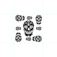
Repeat Pattern Workshop

 Patterns can be an effective way to create a larger version or more complex decorative piece using an illustration.


PHOTOSHOP
  • Create a square tile - something that will later be repeated within the pattern.

  • Turn on the ruler tool and snap the guide into place around the frame and then increase the canvas size in percentage. Lock these guides into place.
  • Open your image and import into photoshop, create the pattern in the middle square and don't let the motifs overlap eachother.
  • Select the central square  - edit - define pattern
  •  New document with transparent layer - edit - fill - pattern - select pattern, choose the one you have previously created.
  • New layer - add colour and CMD select the image layer (by clicking the image of it in layers) edit - fill - colour
  • Edit  - fill - pattern - script - spiral 

  • Changing just one layer 'clip' the layer to the one underneath - click the box with the downfacing arrow to just effect the layer directly below. (make sure colourize is also ticked)


REPEAT PATTERN
  • Place illustration in the centre
  • Place another one slightly over the grid
  • select the box where the drawing is out of the grid and use select tool, click, shift drag to the bottom on the centre box.


Friday 24 February 2017

Antoine Orand

I came across Antoine Orand's work on It's Nice that and feel really draw in by the use of expression and colour within his creative collage. I'm a great fan of using other materials within collages such as this. The use of plastic or another transparent material really adds an element of texture to the piece. 
Collages such as this could be used for backgrounds for pages or interesting pages to include textures and other things to explore.
I'm not too sure that these are appropriate for a children's book but the use of bright colours and exciting expressive marks is something that I could consider when creating the outcome.


Colours May Vary Talk


Today I went to a talk at colours may vary, I love the shop itself and try to visit frequently to get inspiration and enhance my love for design and creativity.
It was really interesting to hear from the owners, Becky and Andy about how they find and choose the work to sell.

They discussed how they like selling prints and ceramics that were all slightly different, they felt that customers liked to have something that they felt was individual to them and they were the only one that owned a little piece from the artists or designers collection. This is quite interesting in terms of creating prints. maybe it's worth while to create hand screenprints instead of digital prints to appeal to the person who loves design and craft.

They discussed what works well in terms of presentation. They tend to sell things that have a commercial value, something that would appeal, not necessarily to mass market but something that is quite a niche appeal to creative people for their shop.

They often consider if the designer has used an appropriate process and if so how this works well alongside the meaning of the book. This was really interesting to here as I feel that I would need to be considerate of this when creating my childrens poetry book.

They suggested that students could come in for feedback for projects and prints, this is definitely something that i would consider doing, perhaps in third year when i feel slightly more pleased with the professional quality of my work. 

In terms of pricing, they said they take a 25% - 60% margin depending on the craft and work towards the piece to be sold. This was interesting because the hand craft compared to the production value needs to be considered in many senses. I'll need to make sure that I'm producing appropriate pieces that use materials that are worth the production value.

When presenting my work to be sold in a shop I should be able to explain  the process and the project itself, WHY have I made what I've made and how will this add something to the shop.

Overall I was really inspired by the talk, it scared me slightly as it seems scary to be ready to be at the professional standard however I feel that in time I will be able to achieve this quality.

Feedback so far

During the crit I was able to get a strong understanding about the thoughts towards my work so far, it was really helpful to know the standard of work that I was creating and to understand whether I should continue to work in the same way.
General Feedback

  • Strong use of colour throughout all of your responsive to briefs, you have used this effectively i order to respond in the most appropriate way.
  • I love the moby background, it's interesting to see you working in a digital media.
  • Really strong use of screen printing techniques within your album covers.
  • I like the concept of the moby design but I feel that you could have used some more textures and skills within photoshop.
  • LOVE the foiling on the album cover.
Overall the feedback was really helpful, it enabled me to understand the direction in which my work was heading and get a feelings towards the general response to it. 
It was quite a positive session and I feel that it enabled me to have the confidence to continue to work in the way in which I have been.

Wednesday 22 February 2017

Responsive Collab

After consideration and discussion with the group, I have decided not to include a character of the bear within the yoyo card. This isn't an exact specification of the brief but at the same time, alot of their other cards have the character as a feature of the cards.

I did start designing a few bears to have an ideas of how a bear could work underwater but I feel that it's slightly irrelevant and doesn't really have any relevance to the story and narrative that we are trying to tell in the brief.

However, I was quite pleased with my bear designs and I was happy that I got to practice my character design as this is something that I really want to try and improve on.


The Newstatesman - Moby Brief

 The new statesman brief seemed like really big challenge for me, I would say that editorial really isn't my strong point but I wanted to really challenege my self and push my self to create and respond to a something that was out of my comfort zone. 

I started by researching, reading the article, getting a better understanding of the situation and looking at the magazine itself and seeing how my work could potentially fit alongside the articles and how I should create work in a similar method...potentially?

The chosen illustration for the article was very digital, personally, I wouldn't say that I was a great fan of it but I could see that it did the job of illustrating the article in a creative and almost humourous way. I felt that i wanted to challenge myself and look at how I could create an almost 'dark' piece that could run alongside the article.
My next steps was to plan out the main features that I took from the article, I found some aspects of Moby's life interesting and intruging and I wanted to include this somehow within the article.
  • Dislike towards hollywood and it's 'culture'
  • Living underneath the hollywood hills
  • Veganism
Following on from this, I began to make a few roughs and sketches that I feel could represent this. I didn't have alot of time for this brief, so I felt that I couldn't extensively rough and plan out everything as I felt that I have in my other briefs.
I went for a fairly simple design as I felt that an editorial piece shouldn't be over complicated and I didn't want the idea to be overpowered by too much detail.
The basic concept is Moby, looking out of his window almost in a fearful way, overpowered by the large hollywood sign standing over him. He has plants in his house to represent his connection with nature and veganism.

I scanned in my design and for a number of reasons, the main being time restraints, decided to make a purely digital illustration, which is something I ...NEVER do!

I really really struggled with the colour and the design on the whole Moby piece, I just wasn't used to this digital way of working and ended up really not liking my design, I felt that it was basic and I had almost gone back to my first year way of working, I felt really frustrated because I wanted to step out of my comfort zone and for it to be a success but I was proven that actually, this is alot more difficult than that!

The idea of Moby being in the shadow of hollywood was almost overpowered and washed over by the over complication of the details in the drawing and the colours that I used and I was just really disappointed. I feel that I have a better sense of narrative after the 504 module but this, for me, didn't correspond to my editorial skills.

Gerry Brakus' from The New Statesman magazine visited today and I had the opporiniuty to show her my work. I explained how I found it a real struggle and I actually ended up showing her a few different colour designs as I just couldn't really chose between them. I explained how I much preferred a narrative approach and hadn't really had much experience with a digital nature of working and she said she could see the creativity and narrative streak within my practice. She explained how the magazine often look for hand crafted illustrations which was actually very reassuring for me to hear as a future practitioner. 

I'm really glad that I participated within this brief but shocked how much I struggled, I'm not sure if I should continue to practice editorial illustrations or try and work my drawings into it in a different way.

Responsive Collab

I've started the process of places my drawings together to create the designs, I'm enjoying playing around with moving the different pieces on the screen as opposed to on paper, which is the process that I normally do.

 The most exciting and innovative steps that we have taken in recreating the cards for the bear brief are as follows:
  • Having the cards all link up in some way and correspond to eachother to create an exciting fold out poster that the child will be able to hang in their room. This is something major that I will need to take into consideration if I want to make this idea work. I'll need something in the designs that corresponds to each card so that they are able to line up in any order!
  • We want to use foiling or something visually interactive in some way, we felt as a group that this would enhance the designs and make them visually exciting for the children to be able to play with.

Tuesday 21 February 2017

Responsive Collab - Refining drawings.

 Following on from my visit at the deep, I thought it would be helpful to refine my drawings and scan them in, in order to see all of the pieces that I have to work with.
I find working in this way very helpful, particurly in terms of working within a group. I was able to show my group these two pages and drawings and we discussed how each element could work together to create the different yo yo cards.
I'm so glad that I was able to collect all of these drawings, it will make it alot easier and faster when it comes to creating the cards, they will almost act as 'stock' images that I can transfer and use within the different cards.

My group seemed really pleased with the illustrations and we began to discuss specfic creatures and narrativs to focus on within the cards. Following on from their research they listed:
  • Blue Spotted Ray
  • Blacktip Shark
  • Green Sea Turtle
  • Whale Shark
  • Clownfish
  • Great Clam
  • Big Box Jellyfish
So far I'm really pleased with how well we're working as a team, I feel like they are giving me a good motvation to do the illustrations for the breif and I feel confident that they will create a great graphics basis to work alongside my drawings.
At the end of the breif I'm hoping that we will all work together to adjust the details and refine any other elements to really use this idea of working together as oppose to me just doing drawings for them to add the text.

Following on from our meeting, I began to sketch out some images of the chosen creatures in order to get a head start on designing the cards. Time restraits do slightly stress me out but I feel that with working with a group I have the motivation to do more work as it's not just for me but for the rest of the group aswell!
 I'm so so pleased with how these drawings have turned out. Although I had to sketch them from online resources, I'm really happy to see how my basic drawing skills have developed! I will need to begin to consider how I can transform these images into a more child friendly approach to fit in within the bear brief, however so far I feel that I've made a really successful start!


Thursday 16 February 2017

Further Research


Following on from my research at the deep, as a group we began to explore the previous designs on the existing bear cards.
We purchased a number of different themes and discovered the use of different:

  • Layout
  • Style of illustration 
  • Colour
  • Size of Illustration
All of this information was useful to know and understand when it came to considering the design aspects of our own cards.
As I looked at more of the cards I found that a lot of these designs consisted of large block colours and shape based illustrations. This really isn't something that I'm used to working with and is potentially something that I would struggle with when it came to creating my own illustrations for the cards.
I began to research other card based children's products and looked at how the illustrations different when placed onto the smaller sized medium.

CIGARETTE CARDS
Although not intended for children, the illustrations on the small size of the old fashioned cigarette cards are detailed and full of small marks and a lot of colour. I think this element of them goes to show that the size of the card doesn't matter, the fact that the person holding the card owns it and will hold and study it, is something that I have to keep in mind.

Perhaps it doesn't matter how detailed the illustrations are, but what matters is the story and characters within the card.

POKEMON CARDS

In contrast, these pokemon cards, designed for children, still have a lot of detail and colour within them. The box for the illustrations is even smaller yet they still have a lot of detail and elements within them that add to their quality and use for children.

Much like the bear YOYO cards, the text and divide between the illustrations and information adds to the use of the card and adds interest for the children to learn and discover.

I think the use of character is so important, especially when appealing to children. If the character is relatable, the child is able to connect to it and want to keep it, and in terms of the YOYO cards, hopefully find more of the sea creatures and thus buy more products.

Overall I'm feeling more confident in terms of being able to create the illustrations for the cards. I worried when I saw the shape driven designs of the other cards and felt that I wouldn't be able to create the pieces to a similar standard.

My NEXT STEPS will be to discuss with my group about the style of design that i am considering and get any feedback they may have, along with discussing the potential facts and text that we could include for the back of the cards.