


After my initial experiments with collage in my sketchbook, i thought it would be a shame to complete the project without having done some for the final outcomes. This felt like a bit of a last minute thing to do but i know that it was effective and worked well in my sketchbook, i'm so glad that i was exhaustive in my sketchbook during the research stage, this has proved very helpful later on within the brief.
I explored the documentary again and looked at taking screenshots, these would be the main images that i would use to collage from. I quite like the almost not 'high quality' images but one taken from video footage, it feels more 'real' and personal in a way. In my sketchbook, i had previously experimented with a similar image so i felt confident to go ahead with the idea having previous tried and tested.
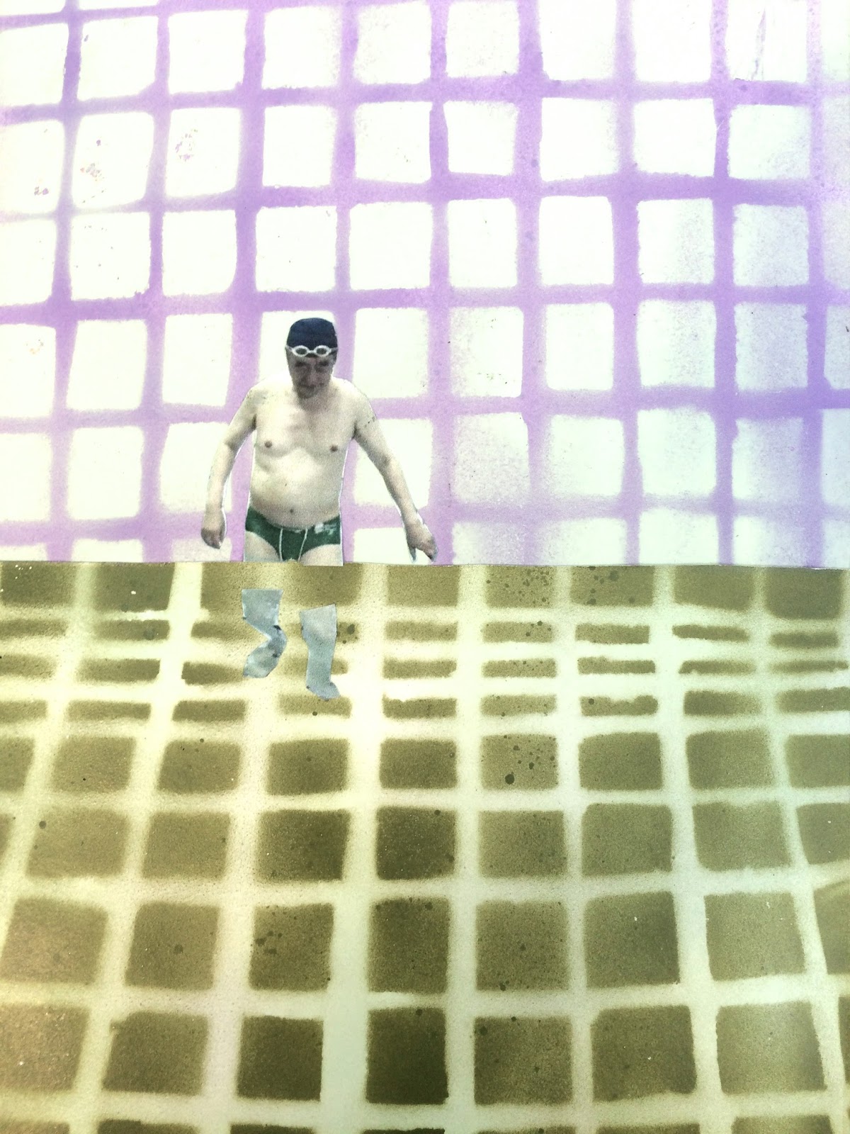


I really like the way i had been experimental with the way i showed Yoshiros legs underwater and i think this would work really well for the stamps. The separation of the images suggests being underwater without being over worked, my research really assisted me with this aspect.
Following on from this i began to consider how i wanted the stamps to work alongside the poster and the postcards, i feel like i needed a similar grid background with the shapes adding to the border of the image. I decided to choose a similar graph paper as it links and works alongside the others but are still their own designs and isn't too overworked for a small section such as the stamp.


I was really happy with how the background turned out, i really wanted to focus on keeping them simple and not overworking them as they're in such a small focus space.
I also kept with in a similar colour scheme which i have learnt is very important when creating things as a set.
Looking back at Matt's feedback, i decided that i should include an image of yoshrios inventions as i began to think that i needed to be even more clear with how i am representing yoshiro as an inventor, not just a man in a swimming pool.
I kept the image of the floppy disk simple to still be able to see what the image was on a small stamp size but still clear what it actually was representing, i was pleased with how i did this.
FINAL STAMPS


WHAT WENT WELL?
- I'm really happy with how they work as a set, they don't overcrowd each other and look good next to each other.
- the designs are simple which is really something i was trying to focus on as i often tend to overcomplicate my work. i find that they're simple without being too basic, there is definitely a difference.
- The colour scheme works really well, i've tried to keep it similar to the poster and postcards in order for them to look consistent together.
- The crafting is something that I'm pleased with, my experimentation in my sketchbook really payed off and helped with the collage aspect in the project, I'm so happy i overcame this.
WHAT WOULD I CHANGE?
- If i were to do the stamps again i would really want to be more experimental with the methods that i used to create them, i feel like if i had more time i could have perhaps looked at print methods or other ways to collage (but keep it simple)
- i wish i didn't have to reuse the designs. even though i feel like they work as a set, i just think i could have done it a lot better by researching more and finding more appropriate images to collage from.
- the graph paper background, although, i feel works, i think could have been used more effectively taking into account the way that the collage pieces and shapes overlay on the top and how this feeds through in order to create the thought patterns and swimming pools aesthetic.
No comments:
Post a Comment