Rainbow

Tuesday 19 April 2016

Persons of note - FEEDBACK

SILENT CRIT
"Something about swimming?"
"Feels very David Hockney"
"Theres a contrast between peaceful imagery and the quotes and text"
"something about idea generation?"
"he seems glum, a bit sad, moody? could he be thinking?"
"repetition of the grid could represent the bottom of a pool?"
"grid could be mathematical? relating to technology with the floppy disk image?"
"Use of collage elements to describe water"

I'm pleased with the feedback that I got from the silent crit, I was really pleased that every grasped the fact that he was an inventor and thought about idea generation, this was exactly what i was trying to portray in my posters and postcards!
I was also really pleased that the group liked the way i had used the shapes in order to describe the water.


Saturday 16 April 2016

Persons of Note - POSTER

To create the poster for Yoshiro, i wanted to use an image of him as this is something that i was working a lot with at the start of the project. I had been doing a lot of portraiture as i found that Yoshrio was a very interesting character to draw. I began the poster making process by finding an image on him from the documentary that I watched and felt was a real turning point in the project for me so i really wanted to make a lot of reference to this within my project.

I made many different drawings on this image as i felt like i wasnt accurately capturing Yoshiros personality. Matt suggested working smaller to be able to use detail in a way that wasnt too overpowering. I found this really helpful and started working on an A5 sheet in which i scanned in a blew up on a larger scale.


After scanning in my design, i used a similar coloration method within Yoshiros body as i use on the postcards as i found this to be a very efftive method and way of working. 
As I have said previously, i wanted to use an element of collage within my work and i have been considering the possibilities of printing each element of the poster off and collaging it together.
WHAT WOULD THIS ACHIEVE?
  • It could look really affective in terms of using collage on another format (not photographs but my own drawing)
  • i really like the hand made nature of collage and i feel like it would really be a great addition to the poster.
  • i could print each element out onto different coloured paper in order to show the separate components of the image.
I began experimenting with image and layering for the background. I was initially really struggling with the way that the colours were working alongside yoshirros body and i didn't feel like it was very effective. After playing around more and looking again at the colour palettes of the postcards, i felt like i needed the poster to be more bold and powerful alongside the lighter pastel colour palettes of the others.


I began layering two of my designs together to create this piece, its something that I'm really happy with and again, i feel like I've been able to achieve the somewhat 'dreamy' nature by overlaying the colours and patterns.


After playing around a lot with the layout of the poster, i felt like the pointing finger wasnt nessasary within the image, it was extra detail that took away from the background and general message of the poster. I also felt like the central composition was the most effective way to show my design allowing him to be the centre of focus.

FINAL POSTER
WHAT WENT WELL?
  • i'm really happy with how the collage aspect of the poster went, i think i used my experiments well and have looked at how i can combined methods of print and techniques in order to create the outcome. 
  • i really like the colours of the poster, I've looked at the colour schemes of the postcards and stamps and like how this have affected the slightly dark palette that i have included within this poster.
  • i really like the composition of the piece, i have considered my space well and by keeping yoshiro in a central position, i looks effective and works well as a poster.
WHAT WOULD I CHANGE?
  • If i were to do the poster again i would probably consider using a better subject, although I'm pleased with it as a whole i feel like i could have gone into more depth with the detail of the piece and the work about yoshrio.
  • i would have considered my colous further, looking at how they could be even lighter to work better alongside the postcards, printing on the blue paper made the colours go slightly darker which is something that i probably should have considered in the design process.


Thursday 14 April 2016

Persons of Note - STAMPS

After my initial experiments with collage in my sketchbook, i thought it would be a shame to complete the project without having done some for the final outcomes. This felt like a bit of a last minute thing to do but i know that it was effective and worked well in my sketchbook, i'm so glad that i was exhaustive in my sketchbook during the research stage, this has proved very helpful later on within the brief.
I explored the documentary again and looked at taking screenshots, these would be the main images that i would use to collage from. I quite like the almost not 'high quality' images but one taken from video footage, it feels more 'real' and personal in a way. In my sketchbook, i had previously experimented with a similar image so i felt confident to go ahead with the idea having previous tried and tested.
I really like the way i had been experimental with the way i showed Yoshiros legs underwater and i think this would work really well for the stamps. The separation of the images suggests being underwater without being over worked, my research really assisted me with this aspect.
Following on from this i began to consider how i wanted the stamps to work alongside the poster and the postcards, i feel like i needed a similar grid background with the shapes adding to the border of the image. I decided to choose a similar graph paper as it links and works alongside the others but are still their own designs and isn't too overworked for a small section such as the stamp.


I was really happy with how the background turned out, i really wanted to focus on keeping them simple and not overworking them as they're in such a small focus space.
I also kept with in a similar colour scheme which i have learnt is very important when creating things as a set.
Looking back at Matt's feedback, i decided that i should include an image of yoshrios inventions as i began to think that i needed to be even more clear with how i am representing yoshiro as an inventor, not just a man in a swimming pool.
I kept the image of the floppy disk simple to still be able to see what the image was on a small stamp size but still clear what it actually was representing, i was pleased with how i did this.


 FINAL STAMPS


WHAT WENT WELL?
  • I'm really happy with how they work as a set, they don't overcrowd each other and look good next to each other.
  • the designs are simple which is really something i was trying to focus on as i often tend to overcomplicate my work. i find that they're simple without being too basic, there is definitely a difference.
  • The colour scheme works really well, i've tried to keep it similar to the poster and postcards in order for them to look consistent together.
  • The crafting is something that I'm pleased with, my experimentation in my sketchbook really payed off and helped with the collage aspect in the project, I'm so happy i overcame this.
WHAT WOULD I CHANGE?
  • If i were to do the stamps again i would really want to be more experimental with the methods that i used to create them, i feel like if i had more time i could have perhaps looked at print methods or other ways to collage (but keep it simple)
  • i wish i didn't have to reuse the designs. even though i feel like they work as a set, i just think i could have done it a lot better by researching more and finding more appropriate images to collage from. 
  • the graph paper background, although, i feel works, i think could have been used more effectively taking into account the way that the collage pieces and shapes overlay on the top and how this feeds through in order to create the thought patterns and swimming pools aesthetic.


Persons of note - Final 3 postcards

FINAL POSTCARDS


WHAT WENT WELL?
  • Overall I'm really pleased with the outcome of my postcards, i feel like my sketchbook practice and methods of experimentation and planning have really payed off and have allowed me to create exciting and meaningful pieces looking at the way Yoshiro creates his ideas underwater.
  • My use of colour is really effective and i really feel like i have been able to create a real atmosphere with the light layering and pastel colour play, creating the sense of being underwater. 
  • I have really considered the use of composition within the postcards, thinking about the swimming poses and how they correspond to the direction of the 'thought patterns' I'm really happy with how I've worked with this. 
WHAT WOULD I CHANGE?
  • If i were to do this again i would i would try to improve my drawing techniques and consider the proportions of the body in more detail. However, I'm still happy with how these have turned out.
  • I don't think i would change much honestly, I'm just so happy with how these have turned out, i love the colours and tones and i wouldn't change very much at all!!


Tuesday 12 April 2016

Persons of Note - Feedback with MATT!

I found the one on one feedback session SO helpful, it really made me make sense of the images that i already had and allowed me to see other methods of creating using what i already had.

FEEDBACK:

POSTCARDS: lovely idea. more swimming studies. need to figure out hands and feed.

POSTER: keep it collage! don't tighten up and play safe!

STAMPS: collage . reduction. shape - of specific inventions?

WONDERFUL SKETCHBOOKS!

Matt seemed to really like my playfulness in my sketchbook and my use of collage and other media such as spray paint, this felt really encouraging and i came away from the crit feeling really enthused and wanting to continue to work in this experimental and creative way! 

I completely agree with the feedback and i will work on the hands and feet on my postcards in order to add extra detail to them, i think this will enhance them further. 
I like the idea of using collage on my poster seeing as i have experimented so much with it in my sketchbook, it would seem a shame to not use it at all in my outcomes.
I'm un sure about using block shape and colours in my stamps just because i know that they are so small, this is something that i will have to work out nearer the time.


Friday 8 April 2016

Persons of note - MORE postcards!

Following on from the development of my first postcard, i have decided to keep the other designs within a similar theme, sticking to the idea of representing thought process and colour and shape in order to represent the swimming pool and the way that Yoshrio creates his inventions.


  • i think it's very important to keep this idea of continuity throughout my postcard designs in order to make sure they work as a set.
  • i want to explore different swimming positions that yoshrio could be in and other colours i could use but still keep within the idea of being underwater with the almost 'dreamlike' appearance to them.


Unfortunately I didn't take screenshots as i went along the process, but my method was very similar to before where I would choose a colour palette and explore the way that I could create it using scanned in spray paints and methods of layering and 'multiplying' the layers on photoshop. I also used the scanned in cut paper as a method of layering and adding depth to the image.
WHAT I LIKE?
  • DREAMY, i love how the colours and methods that i have used such as the overlay and repetition of patterns and layers really create an almost dreamlike feel, which is all corresponding to the idea of thoughts and ideas being created underwater, this is something that I've really been working hard on to create.
  • colours work really well together. I've been trying SO hard to create colour palettes within my work so that they work harmoniously together and i really think i have succeeded within this brief so far.
WHAT I DON'T LIKE!!!?
  • I feel like i could work harder on the composition of the pieces, so that the shapes all line up with one another creating a line of sight within the work!?
  • They are maybe TOO dreamy at the moment? i think this will definitely change once i have put the image of yoshiro swimming in, but its just something that i need to experiment with at the moment. 


Wednesday 6 April 2016

Persons of Note - Photoshop

I have started to experiment with using a digital approach in my work. I felt that this would tie all of the different techniques that i was using together and make it easier to be experimental with colour and shape and sizing of elements within the image. 
I scanned in the different spray paint backgrounds and paper shapes and drawings that i had been working on. Seeing as I have already worked on a non digital platform planning out this idea for the postcards, i feel confident with how i will place the pieces together and how the colours will look together. Im really excited to see how it will translate onto a digital platform though - perhaps i could be experimental with layering and how the colours can combine and work together in ways that I can't make them do on a hand made level.


My first steps were to follow what i know from my experiments with the paper cuts in my sketchbooks and my roughs. I enjoyed placing the pieces together and found that it was so much easier and more flexible to work with when completing the same image on photoshop.

Despite working well in my roughs and initial designs for this idea, i feel like Yoshiro with no colour and the coloured background doesn't work as well as it potentially could. It's like its missing something, it looks somewhat empty....!?


I have experimented with adding a simple coloration and even this on its own works so well an so much better than the white body. I'm really pleased with myself how I've planned out the colours that I've used in order for them to work coherently together!! The peachy and mint tones work really well together and create an almost relaxing tone to the work, provoking the idea of idea making and creation which I am trying to show.
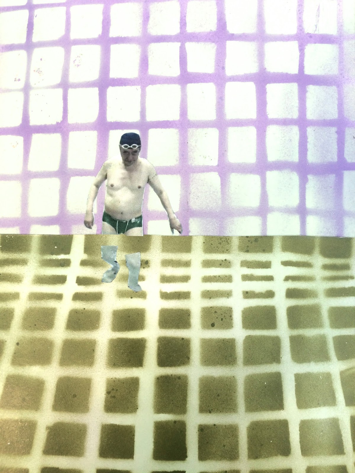
I like how the work is quite subtle, the tiled pool edge is just hinted at in the corner rather than overtly displayed.
After expiermnetation, I began to overwork my designs. Although I am happy with the way the colours work together I feel that when working together they don't have as much impact as they do when used in a more subtle manner. 
I asked the opinion of another student in order to get some feedback on my work. They suggested that the overworking of the colours makes them look dull which is a shame to miss out on the potential effect that the colours could have!


After even further experimentation and reduction of the colours I began to appreciate how using shapes and colour subtly can give them even more effectiveness. I think this is a really important aspect. I want to continue to make the other postcard designs in this way.
I am really pleased with how my photoshop knowledge has progressed, on the final design (for now) I have used a mixture of the blend and multiply tools in order to create a water like effective, playing with the way that light and shapes change underwater.