

Monday, 8 May 2017
Sunday, 7 May 2017
Folder for Submission
I wanted to reflect my work in a way that showed it in it's best light, my favourite aspect my work is the colour scheme and my use of foiling, I felt that I needed to produce a folder to present my work in a way that showed this element.


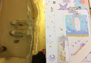


I used a gold metallic card and lilac front to present my work in a visually appealing way that matches the aesthetic of the work as a whole.
I'm extremely pleased with submission and I wanted to represent it in a way that I was pleased with.
APPLICATION

The mobile would be:
- Included within the book, a fold out, pull out aspect that can be created.
- Accessible for children and adults.
- Transferred onto a more sustainable products such as wood or acrylic.

I'm really pleased with the format of this design, I feel that although playful and childish, it is still accessible and creative enough to be appealing to the adult audience. That was my aim for this application and I feel that it has been very successful.
Saturday, 6 May 2017
APPLICATION
I have been considering other applications that would work for my product, I feel that the characters are something that would appeal and be an almost loveable duo and with this, could be an application to many products that could potentially appeal to a wider audience other than just readers of the book.
My book focuses on the idea of being accessible to children and adults, I have already considered applying my designs to the stickers and mobile as well as the main product of the book. I feel that the aestethic of the creative nature could be something that would translate well to a tote bag.
The audience that I am aiming for within the adult section would be the type of person who would wear creative tote bags, they would want to show their interests through the accessories that they wear and show.
I feel that a tote bag is the perfect combination of these aspects and through the use of my book cover design I think that the application of it works perfectly.

Thursday, 4 May 2017
Final Foiling
Throughout my whole progress I feel that my skills within foiling have really advanced, I'm so pleased that I challenged myself to learnt this skill and I feel that it has not only really enhanced my current work but I feel that I will use it again in the future and allow my work to become more professional through the use of media and technique.


Despite aspects of the foiling going wrong in terms of position, I'm still incredibly pleased with how this element of my work has turned out.
I feel that I have been successful in terms of creating multiple products that produces something that cannot be accessed online. This was my initial goal for this module and through the use foiling, I would hope that my range of applications would appeal to not only children but also creative adults who like the aesthetic of the brand and the characters that I have created.
APPLICATION - BOOK
Through my extensive design process I feel that I have been able to design a really successful spread to the book. Through the inital creation of the characters, I found it quite a simple process to apply the same ideas and designs to the other aspects of my designs and merchandise.

I used a similar process to create the spread of one of my book pages to give a general idea of how the piece would look when created. I’m really happy with how everything has come together and I feel that I have planned and experimented extremely effectively in order to gain a strong understanding of this process.

Tuesday, 2 May 2017
STICKERS
Once I had the images for my book, I found it fairly simple to apply them to other merchandise.
Stickers are something that I feel can appeal to both children and adults alike, they are a fun and versatile way to decorate and keep a particular image, and in this case I feel that the image itself can be used to create a new meaning to the character depending on where it has been stuck.
I wanted to keep in mind this aspect when coming to design my stickers and the sheet in which they will be stuck to.
I would like to think that the stickers come as a part of the book, a pull out page that can almost be seen as a 'free gift' or an added enhanced aspect of the book making it almost an activity book that can be enjoyed by all.
If this wasn't feasible then I would consider having the stickers sold separately to the book almost as a piece of stationary or merchandise to sell to fans of the poetry book characters.

BOOK LAYOUT
Following on from the creation of my front cover, I felt confident that I would be able to go straight in and continue working in a similar way to create a spread of the book.
I really liked using the images from life drawing in order to create the characters bodies and I felt that this needed to be an ongoing theme throughout the book.
I found it fairly simple to apply the same elements of design onto the new layout and spread of the first page and I feel that it works well and displays the idea and tone of voice which was intended.
I looked back at my initial research of children's illustrations and considered the use of expressions and over exaggerated faces and applied this to my work.

Continuing on from this, I was able to combine the spread with the first page. I considered how I had worked this within my roughs and kept to a similar means of creation.
As a mock up, I experimented with using the yellow plastic ring binding method on photoshop to see how the colours and aesthetic worked alongside my work.
I feel that it looks exactly how I intended it to look, taking elements of playfulness and the childlike, creative nature of the book and changing it into a tactile product that can be, read, played with and appreciated by all ages.

NEXT STEPS
- Consider how the images from the book can be placed within other merchandise and used to appeal to the same audience in an exciting and innovative way.
- Consider the use of foiling, this was one of the main reasons for creating a physical book so I need to express this method of creation and how it would be done to appeal to the target audicce and have the element of appeal and visual attraction in which I am aiming for.
Final Crit
during my fianl crit I displayed my final designs with aspects of foiling, I felt confident that this represented my work well and to a high standard that I was pleased with.

Overall, I'm really pleased with the feedback I recieved, Im glad that my designs have worked out and people can tell what the intention of them are for.
My next steps are to finish off the design process and complete the application of my designs to other products.

Overall, I'm really pleased with the feedback I recieved, Im glad that my designs have worked out and people can tell what the intention of them are for.
My next steps are to finish off the design process and complete the application of my designs to other products.
Monday, 1 May 2017
FRONT COVER CREATION

Following on from the creation of the characters, I felt confident enough to go straight into designing the other characters, using elements of colour and pattern that I have experimented with throughout my sketchbook.
I took colour aspects from my spray painting experiments and applied them to the stars and planets, trying to keep the same 'screen print' half tone aesthetic.
I added details such as the lines from the stars, however, I wanted to keep the cover fairly simple as I am going to add elements of foiling over the top to create and shimmer effect that will hopefully allow the cover to stand out amoungst other books of a similar degree.
Overall I'm really happy with how this cover has turned out, I like the simplicity of it and I feel that I have been very considerate of colour and texture and how this has an effect on the characters themselves.
I have used a simple text as I will be using foiling so I didn't want to overcomplicate this element of the book.
NEXT STEPS
- Now that I have each of the elements of the book including background embellishments and smaller characters
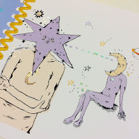
CHARACTER CREATION
I feel like my time is running out, I am procrastinating too much on the smaller details, a lot of which don't matter and I need to make the characters that I am happy with.
I feel that I have the initial designs and my colour palette is pretty set so it's just about actually doing it.
I started by choose the positions of the life drawing sketches and positioning the star and moon heads over the top as I had previously experimented with in my sketchbook.
I then looked at the colour palettes that I have been working with and applied them to the bodies and heads in a way that wasn't too obstructive but used elements of texture and pattern.
I wanted the book to have a hand made feel and I think that the use of the screen print dotted half ton texture that I have used works really well to enhance this element.
 Overall I'm really pleased with how the main characters have turned out, I feel that I just needed to MAKE them rather than over plan and over think the creation.
My next steps will be to work this same use of texture and colour into my other aspects of the background and other smaller characters and then begin to form the pages together.
I am slightly worried about time at this point, I don't want to rush but I feel that I really need to get going if I want to finish all of my goals that I have set out to achieve.
I feel that I have the initial designs and my colour palette is pretty set so it's just about actually doing it.
I started by choose the positions of the life drawing sketches and positioning the star and moon heads over the top as I had previously experimented with in my sketchbook.
I then looked at the colour palettes that I have been working with and applied them to the bodies and heads in a way that wasn't too obstructive but used elements of texture and pattern.
I wanted the book to have a hand made feel and I think that the use of the screen print dotted half ton texture that I have used works really well to enhance this element.

My next steps will be to work this same use of texture and colour into my other aspects of the background and other smaller characters and then begin to form the pages together.
I am slightly worried about time at this point, I don't want to rush but I feel that I really need to get going if I want to finish all of my goals that I have set out to achieve.
Subscribe to:
Comments (Atom)